


Optometrist Website Design for Eye Care Practices
I design and build optometrist websites for eye care practices and optical shops: exam booking in a few taps, a frame catalog from your own shelves, contact lens reorders, insurance details people can find, and type that stays readable for visitors who came because they cannot see well.
- Design + build, one price
- From 700 €
- Reply within one business day
What you get with optometrist website design
- Readable without glassesLarge type, strong contrast, works at 200% zoom
- Exam booking in three stepsOffice, type of visit, time — from your scheduler
- A frame catalog from your shelvesBrands, shapes and prices, reserve to try in store
- Contact lens reorders without a callA short form for existing patients
- Booking forms without health detailsName, phone, office and time — records stay in your system
- Readable by Google and AI assistantsOffices, doctors, plans and hours as text
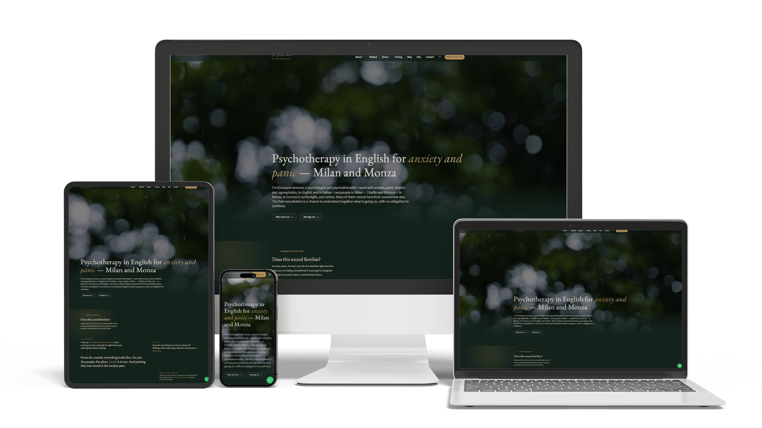
Bilingual psychotherapist website in Italy
468 of 468 posts moved2 languagesSeen in ChatGPT answers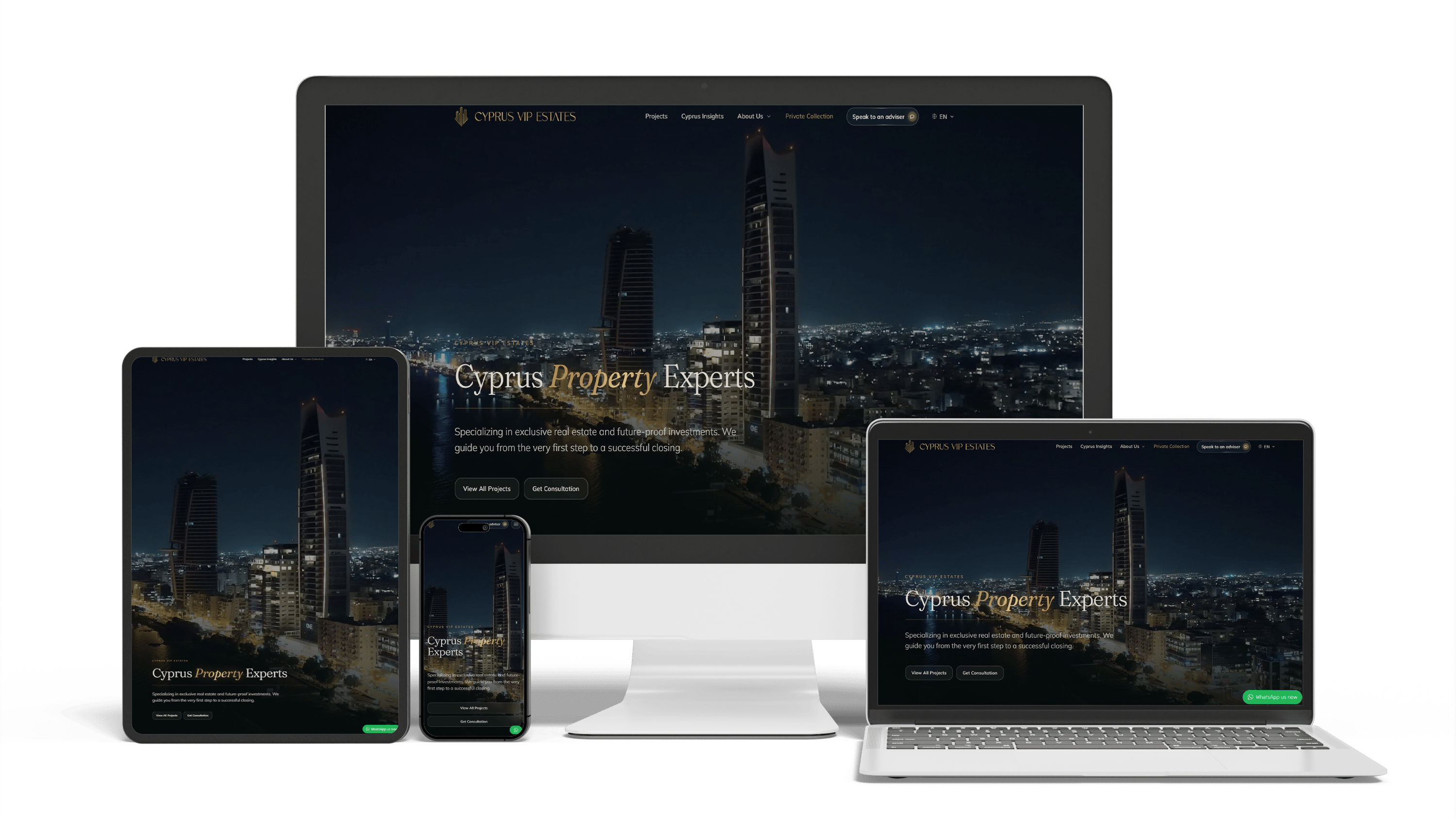
Multilingual real estate platform in Cyprus: SEO and GEO without bought links
16× faster editingTraffic from ChatGPTLeads via WhatsApp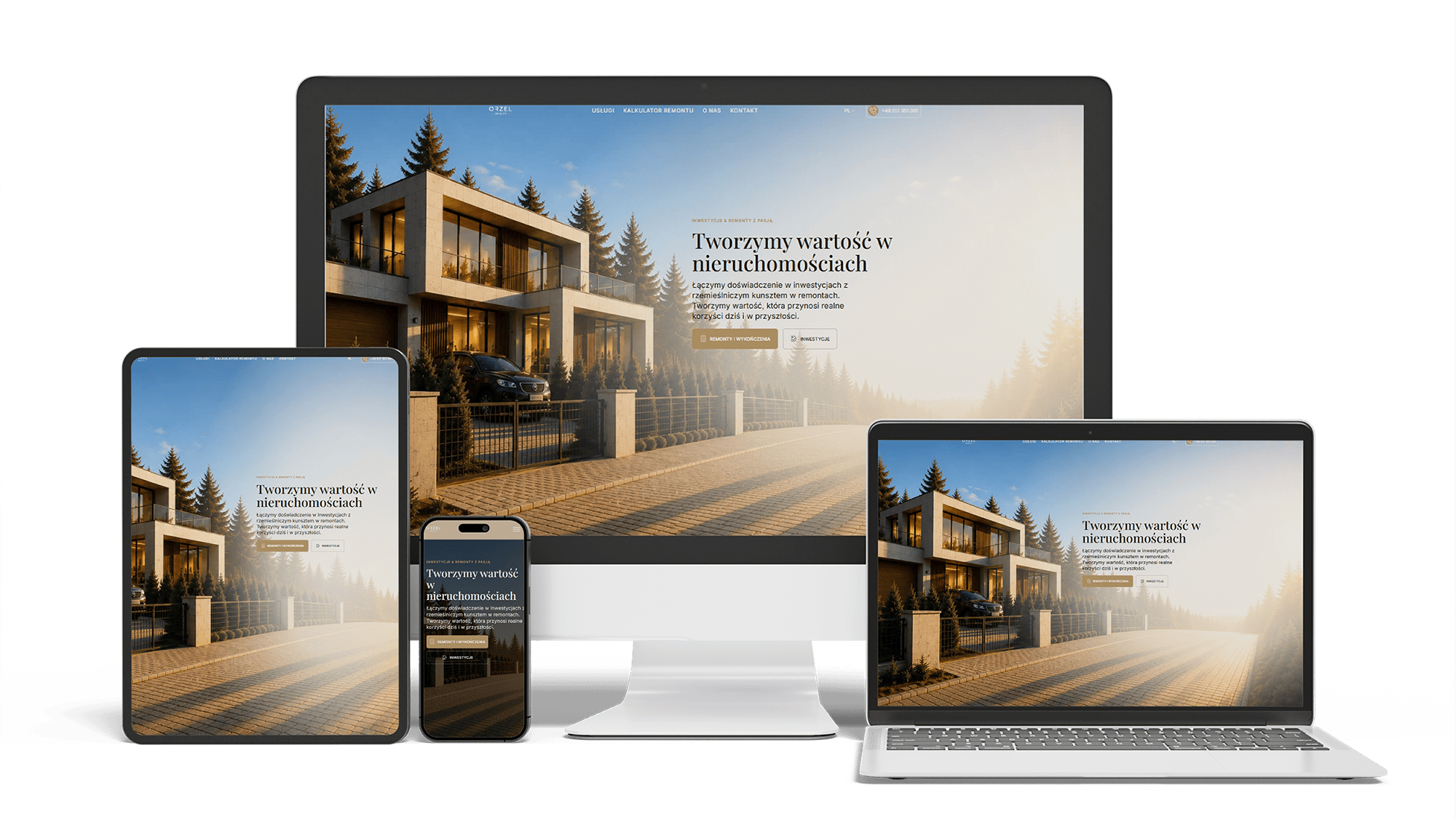
Renovation and investment website with a premium feel and 96/98/100/100 performance
96/98/100/100Design system2 languages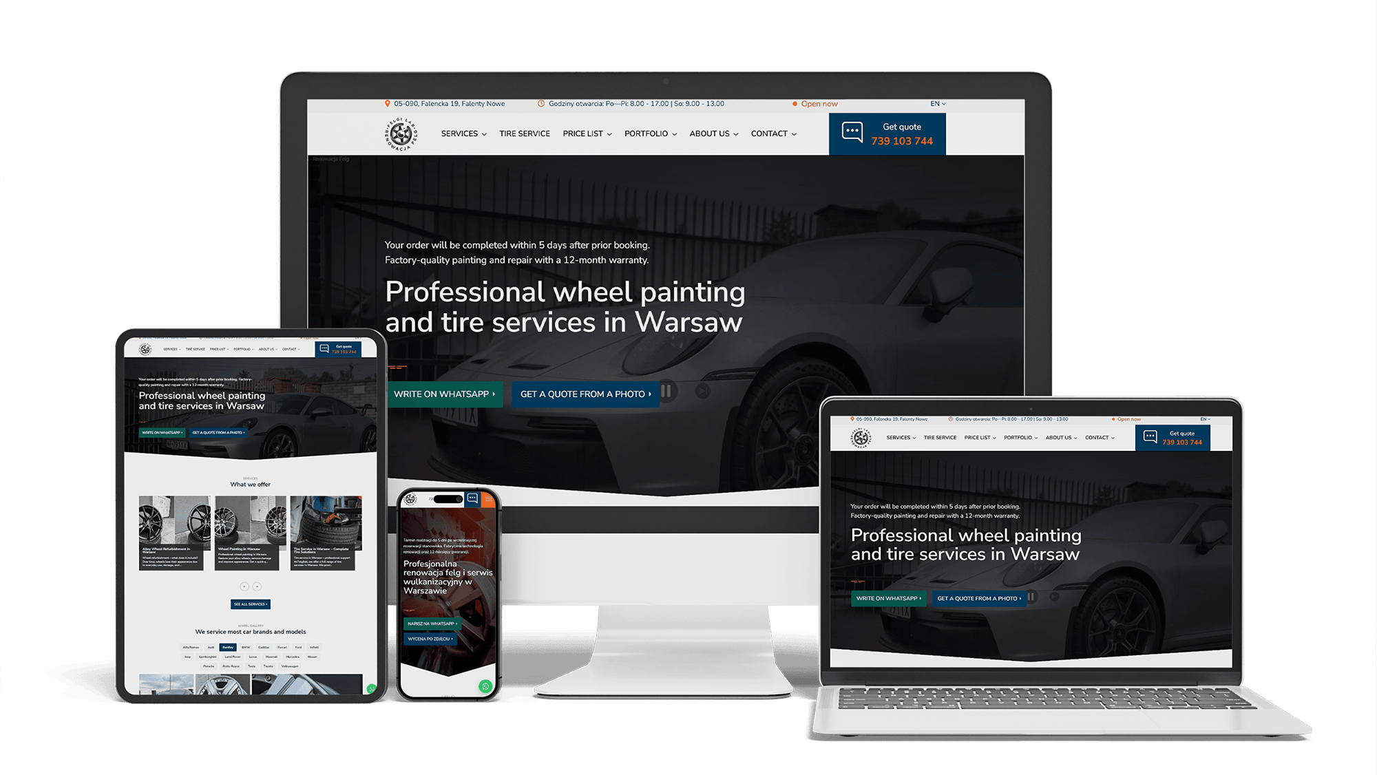
Full WordPress Rebuild for a Car Rim Restoration Company
92/91/96/100Photo quote formLocalBusiness markup
Full Multilingual Website Development & SEO for Student Services
+5,930 clicks in 6 months359k impressionsTeam edits it
Get a quote for your optometrist website
I reply within one business day with a proposed layout for the home page, the exam booking path and an office page, and a fixed price.
I do optometrist website design for eye care practices and optical shops, and I build the sites myself, so the layout, the code and the booking setup come from one person at one price. Visitors to an eye care website are often reading without their glasses, on a phone, sometimes right after an exam with dilated pupils. That one fact shapes most of the decisions below.
Someone opening your site wants one of four things, and the first screen points to each of them without scrolling:
- book an eye exam — the main button, in the one accent color the site uses
- find the nearest office, with today’s hours and a tap-to-call number
- see which frames and brands you carry
- reorder contact lenses or pick up glasses that are ready
The headline says what you are and where: “Eye exams, glasses and contact lenses in [your town]”, not “See the world clearly”. A rotating slider with brand campaign images looks good in a vendor demo and hides all four actions on a phone.
An eye care practice has more visitors with poor eyesight than almost any other business, so accessibility here is the brief itself. I design to the WCAG guidelines and test the result:
- body text of at least 18 pixels on phones, line spacing that keeps lines apart, no light gray text on white
- contrast at WCAG level AA or better, including buttons and form fields
- layouts that still work when the browser zooms to 200% or the phone uses large system text
- no text inside images, so screen readers and zoom both work
- clear focus outlines and full keyboard navigation
Low-vision patients notice when a practice that treats eyes has a site they cannot read. The opposite is a quiet sign of care.
Booking follows the order people think in: choose the office, choose the type of visit — routine exam, contact lens fitting, child’s exam, dry eye or an urgent problem — then a time. The scheduling itself comes from the system you already run — its embedded calendar or booking link — and where patients cannot pick slots themselves, a three-field request your front desk answers. On a phone, “Book” and “Call” stay pinned to the bottom edge of every page.
The confirmation page tells people what to bring: current glasses, contact lens boxes, the insurance card and a list of medications. It also says whether the exam includes dilation, so nobody arrives planning to drive straight back to work.
Frames are what people browse for fun, and a catalog gives them a reason to visit the shop. It works as a catalog, not an online store: filters by brand, shape, material, size and price; real photos taken on your shelves; and a “reserve to try in store” button that sends the frame and the office to your staff. I built the same pattern — filters, a map, structured listings — for a real estate catalog in Cyprus.
Your staff update frames in a simple editor, one entry per model with several photos. Virtual try-on tools exist and can be embedded, but they are heavy on phones; I add one only if your patients ask for it.
Existing patients who wear contacts need one short path: name, contact details and the office, sent to your staff, who look up the prescription on file and reply with the price and pickup date. No prescription details typed into the form, no uploads through plain email. This keeps reorders with you instead of with an online seller.
Insurance is shown as text in a short table: vision plans and medical plans accepted, per office if they differ, plus a line on what happens with plans you do not take. Logos alone fail twice — screen readers skip them and nobody can search the page for a plan name.
Trust comes from seeing the people and the place. Each optometrist gets a profile with a real photo taken in your own exam room, the OD degree, license, fellowships, languages and the days they work at each office. Photos of the frame wall, the waiting area and the equipment replace stock models in white coats.
For Giuseppe, a psychotherapist in Milan, I designed a calm site for anxious visitors: a dark theme with light sections, a serif with a true italic, a map of his three consulting rooms. An eye care site needs a lighter palette, but the same restraint — one accent color, generous spacing, nothing that moves while someone is reading.
Patients will type anything into an empty message box, including a diagnosis or their last prescription. For a US practice that information is likely protected under HIPAA, and any outside service that stores it may need a business associate agreement with you. Three design choices avoid most of the risk:
- general forms ask for a name, contact details, office and preferred time, and say plainly not to describe symptoms
- intake forms and prescription questions go through your practice management system or a form provider that signs a business associate agreement
- analytics and advertising scripts never run on booking and reorder pages
Years ago I worked on a medical system that processed patient records; it is under NDA and stays unnamed. The habit it left me: a practice website should hold the least health data its job needs. Whether a setup meets your obligations is confirmed by your compliance adviser.
Questions like “which eye doctor near me fits contacts for astigmatism” or “who sees kids and takes my vision plan” now go to ChatGPT, Perplexity and Google’s AI Overviews as often as to the search box. An assistant can only repeat facts it finds as text. So offices, doctors and their credentials, services, hours, languages and plans live in HTML and structured data, word for word the same as on your Google profiles.
Giuseppe found me by asking ChatGPT, and the new pages of his site already appear in ChatGPT answers. Earning a place in those answers takes steady work after launch — see the AI SEO and GEO optimization page; ranking in Google for exams and frames in your town is covered on the optometry SEO page.
Eye care vendors such as iDoc, EyeCarePro and iMatrix sell websites on their own platforms, often with marketing services attached. For a single office that needs an address, hours and a booking link, that can be enough. The limits appear later: shared template text, a frame section that is a row of brand logos, little control over speed, and a site you cannot take with you if you leave.
A custom site belongs to you — code, content and domain. Leaving a vendor platform does not have to cost rankings: I list every old URL and point it at its new home with a 301 redirect before launch. Giuseppe’s practice kept all 468 blog posts this way, each old address redirected.
Galleries of the best optometry websites mix national chains and small practices. What the good ones share fits a two-office practice too:
- exam booking visible on every page, with the type of visit chosen before the time
- an office page for each location, with doctors, hours and plans
- frames shown from the real shelves, by brand
- text that stays readable at large zoom
- a reorder path for contact lens wearers
- Brief. You send your offices, doctors, services, plans, brands you carry and the questions your front desk hears most.
- Paths. I map booking an exam, browsing frames and reordering lenses, and we agree them on a phone screen.
- Design. The home page, the booking path, an office page and the frame catalog are drawn completely first; every other page reuses their parts.
- Build and handover. Booking is connected, forms and accessibility are tested, and your staff get a manual for editing frames, hours and doctors.
Giuseppe’s site went from first code to handover in 44 working days, and he received a written manual and video walkthroughs. How I build sites in general is on the website development page; doctors and clinics outside eye care have their own page on medical website design.
- A simple site for an optometrist or optical shop — home, services, frames by brand, insurance, contact and booking link: 700–1,400 €.
- An eye care practice website with office and doctor pages, exam booking, a frame catalog with filters, contact lens reorders and accessibility testing: from 2,000 €.
Design is included in both. Full ranges are on the pricing page.
Optometrist website design: frequently asked questions
Order optometrist website design: what to send me
Send the practice name, a link to the current website or Google profile, your offices and doctors, the frame brands you carry, the vision plans you accept and the scheduling system you use. Add a few phone photos of the frame wall and the exam lane, and the first draft will already show your own shop. You get a layout sketch and one fixed price back. Use the form above or write on WhatsApp.