


Startup Website Design
I design and build startup websites: a pre-launch or waitlist page, a home page that says what the product does in one sentence, real product screens, a pricing page and analytics from day one — on a design system that grows with the product.
- Design + build, one price
- From 700 €
- Reply within one business day
What you get with startup website design
- A waitlist page connected to your toolsSignups land in your email tool or CRM, not an inbox
- Real product screens and a short demoCropped, annotated, light enough for a phone
- A pricing page buyers can readPlans, limits and the next step, without “contact us” walls
- A design system that growsComponents in code, so new pages take hours, not weeks
- Analytics and events from day oneSignups, demo requests and pricing clicks tracked at launch
- Fast on a phoneMain content under 2.5 seconds, readable by Google and AI assistants
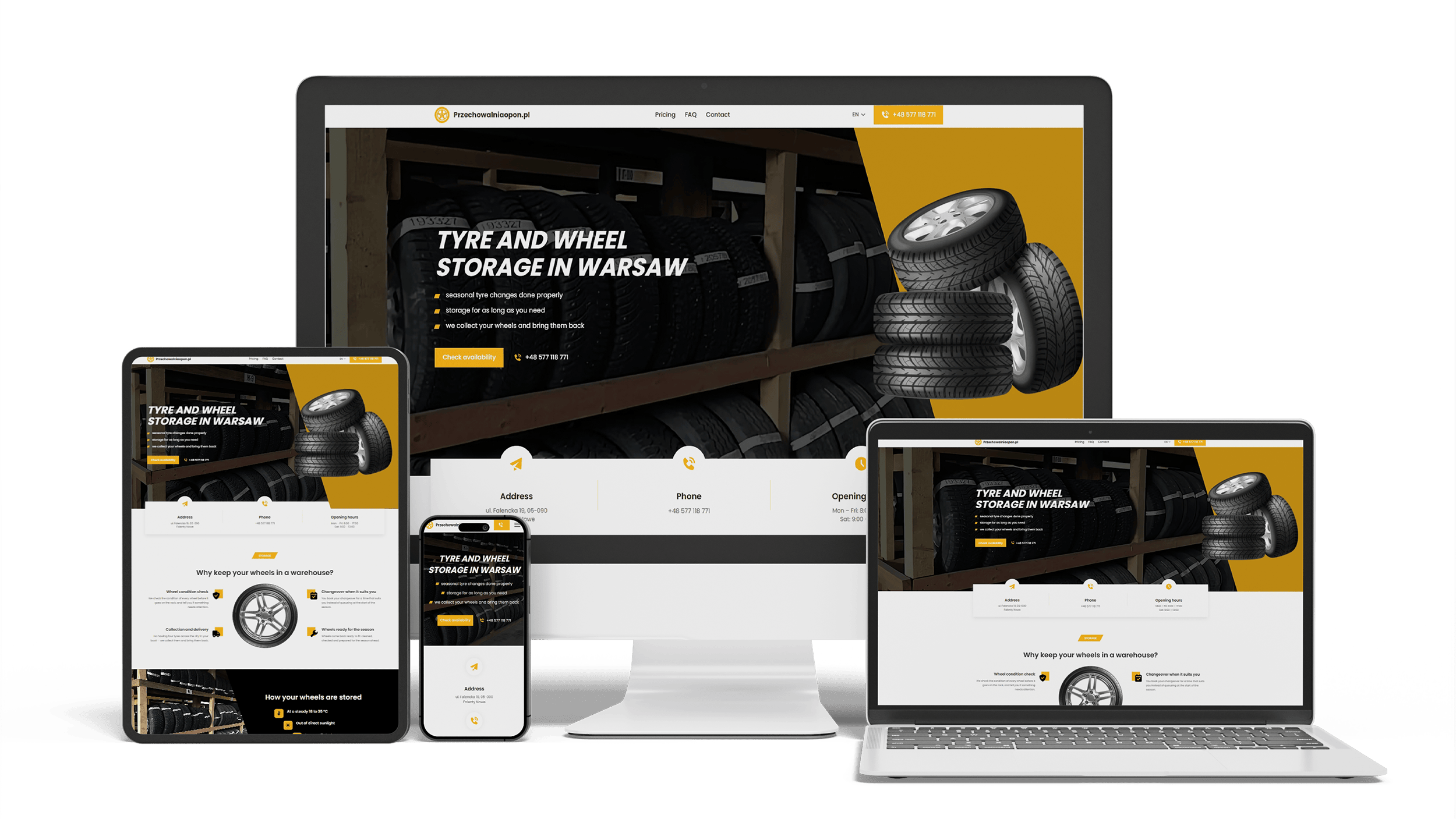
A multilingual landing page for a wheel and tyre storage business
100/95/100/1003 languagesClient edits it
Full Multilingual Website Development & SEO for Student Services
+5,930 clicks in 6 months359k impressionsTeam edits it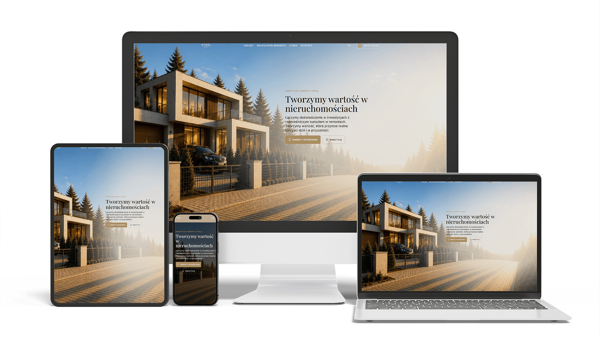
Renovation and investment website with a premium feel and 96/98/100/100 performance
96/98/100/100Design system2 languages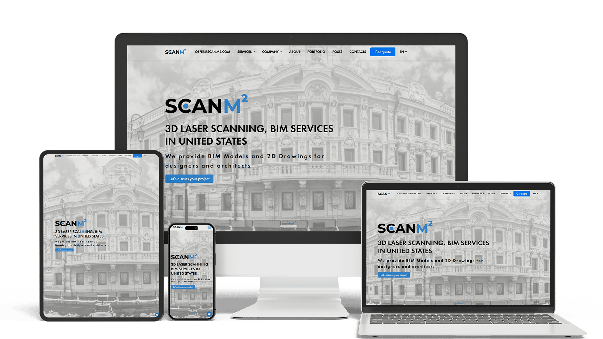
Architecture Website Rebuild and SEO
29× organic trafficLoads in under 1 sTop 3 in Poland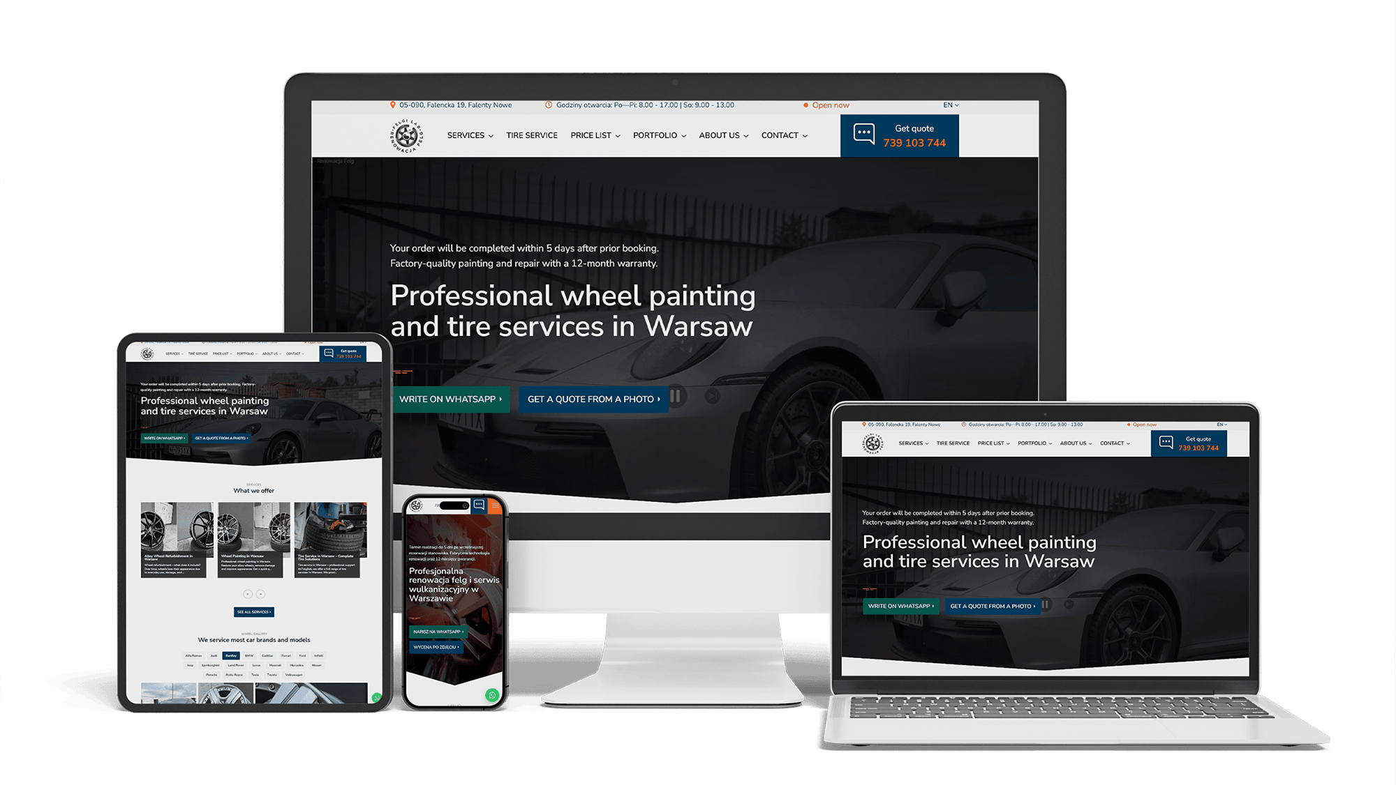
Full WordPress Rebuild for a Car Rim Restoration Company
92/91/96/100Photo quote formLocalBusiness markup
Get a quote for your startup website design
I reply within one business day with a proposed structure for the first pages, the stack I would use and a fixed price.
I provide startup website design together with development: I design the pages and build them myself, so one person and one price cover both. A startup site changes faster than any other kind of website — the message shifts after the first fifty customer calls, a pricing plan appears, a new integration ships — so the design has to work on launch day and still hold together six months later.
Before the product is ready, the website has one job: explain the problem well enough that the right people leave an email. A pre-launch site needs less than founders expect:
- one sentence that names the problem and who has it, and a second one that says how the product solves it
- a picture of the product — a real early screen or a careful mock-up, labelled as a preview
- one action: join the waitlist, request early access or book a call
- who is building it, with names and faces, because early users and investors both check
Everything else — feature grids, testimonials, a blog — waits until there is something true to put in it. Placeholder logos and invented quotes on a pre-launch site are noticed, and they cost trust exactly when you have the least of it.
A landing page for startups is usually the first thing paid ads, launch posts and investor emails point to. A waitlist page works when it qualifies people as well as counts them:
- a short form — email plus one or two questions such as role or team size — so you know who signed up
- an honest promise of what happens next and when
- signups sent straight into your email tool or CRM, with the source of each one recorded
- a separate version of the page for each campaign, when messages differ, so you can see which one works
How I build landing pages for any kind of business, startups included, is on the landing page development page.
Lists of the best startup websites are full of beautiful animation, but the sites that convert share plainer decisions. On the first screen, without scrolling:
- what the product does, in the words buyers use — “Invoices that chase late payments for you”, not “The future of finance”
- who it is for, when that is not obvious from the first line
- one main button — start free, book a demo or join the waitlist — and at most one quieter second option
- a real screen of the product, not an abstract illustration
Inspiration boards on Dribbble and Pinterest show attractive screens, but they are made to be admired. Website design for a startup is tested by a different question: can a stranger repeat what you do after five seconds?
Buyers want to see the product before they give an email. The design plans how it is shown:
- screenshots cropped to the part that matters, with a short label, instead of a full dashboard at thumbnail size
- a demo video of a minute or two, with captions, because many people watch with the sound off
- an interactive demo or a sandbox account, when the product is easier to try than to explain
Screens change with every release, so they are kept as separate images or components that can be replaced without touching the layout.
Buyers who reach the pricing page are close to a decision, and an unclear table is where many of them leave. A pricing page that works:
- two to four plans, each named for who it is for, with the limits that differ written out
- monthly and yearly prices, with the difference shown in money, not only as a percentage
- a clear answer to “what happens when I go over the limit”
- short answers to billing questions — trial length, cancellation, invoices, VAT — under the table
If the price is not settled yet, the page can show plans without numbers and a “talk to us” button, but the plans and limits should still be there. Buyers and AI assistants both treat a missing pricing page as a warning sign.
Investors usually open the site after reading the deck. They are checking whether the company is what the deck says. Startup company website design takes this into account without turning the site into a pitch:
- an about or team page with real names, roles and links to professional profiles
- a press or news page with dated announcements, once there is something to announce
- a media kit — logo files, product screens, a short description — so journalists and partners use the right ones
- traction numbers only if you are ready to make them public and keep them updated
A startup site that starts with five pages often has fifty a year later: use cases, integrations, comparisons, changelog, careers. Designing each page by hand does not scale. I build the site from a small set of components — section types, cards, pricing tables, screenshot frames, forms — defined once in code with shared colors, type sizes and spacing. A new use-case page is then assembled from existing parts in hours, and a change to a button style updates every page at once.
Founders often add analytics after launch and lose the first months of data. In the design stage I list the actions that matter and track them from the first day:
- waitlist and signup submissions, with the campaign or page they came from
- clicks on start free, book a demo and pricing plan buttons
- demo video plays and how far people watch
These go into GA4 and Google Search Console, or into the product analytics tool you already use, such as PostHog, Mixpanel or Amplitude. In the EU, a consent banner is part of the design, not an afterthought.
Webflow and Framer are good tools. If the team has no developer, the site is a few pages and marketing needs to change text daily, one of them may be the right choice, and I will say so. A custom Next.js site pays off when:
- the marketing site should share components, styles or data with the product, which is often built in React
- you plan dozens of use-case, integration or comparison pages generated from data
- you need several languages, custom forms or integrations without per-feature add-ons
- speed matters: main content under 2.5 seconds on a phone, with no builder scripts on every page
What goes into the build — stack, hosting, CMS, ownership of the code — is covered on the startup website development page; how I build websites in general is on the website development page.
Buyers ask ChatGPT, Perplexity and Google’s AI Overviews which tool fits their team, and assistants answer from what they can read. A design that keeps the product description in an animation, features in images and prices behind a form hides the facts; the same content set as real text, with structured data for the organization and the product, can be read, compared and repeated.
Getting into those answers is ongoing work, described on the AI SEO and GEO optimization page. Ranking in Google for your category, use cases and comparisons is covered on the SEO for startups page.
- Brief. You send the one-sentence description, the audience, competitors you are compared with and the action that counts as success.
- Phone layouts. I design the home page and one inner page on a phone screen and agree them with you.
- Design system and full design. The other pages are assembled from the same components; desktop versions follow.
- Build and launch, with analytics and events working on the first day.
Design is part of building the site, and the price covers both. If you do not have a logo yet, the site can launch with a clean text logo and take on a brand identity later.
- A pre-launch or waitlist website: 700–1,400 €.
- A startup website with product, pricing and use-case pages, a design system and analytics: from 2,000 €.
Full price ranges are on the pricing page.
Once the product has paying customers, the site takes on a different job — feature, integration and trust pages for buyers: SaaS website design.
Startup website design: frequently asked questions
Order startup website design: what to send me
Send the product name, a link to any current site or prototype, the one sentence that describes what the product does, who it is for, the competitors buyers compare you with and the action that counts as a conversion — waitlist, signup or demo. I will reply with a proposed structure for the first pages and a fixed price. Use the form above or write on WhatsApp.