

Consultant website design, SEO and GEO: a trilingual site for a retail analytics consultant
A consultant website that answers the client's questions before it sells: 153 pages in three languages, five retail calculators, downloadable templates and pages built to be quoted by AI.
Client
Industry
Services
Website
Problem
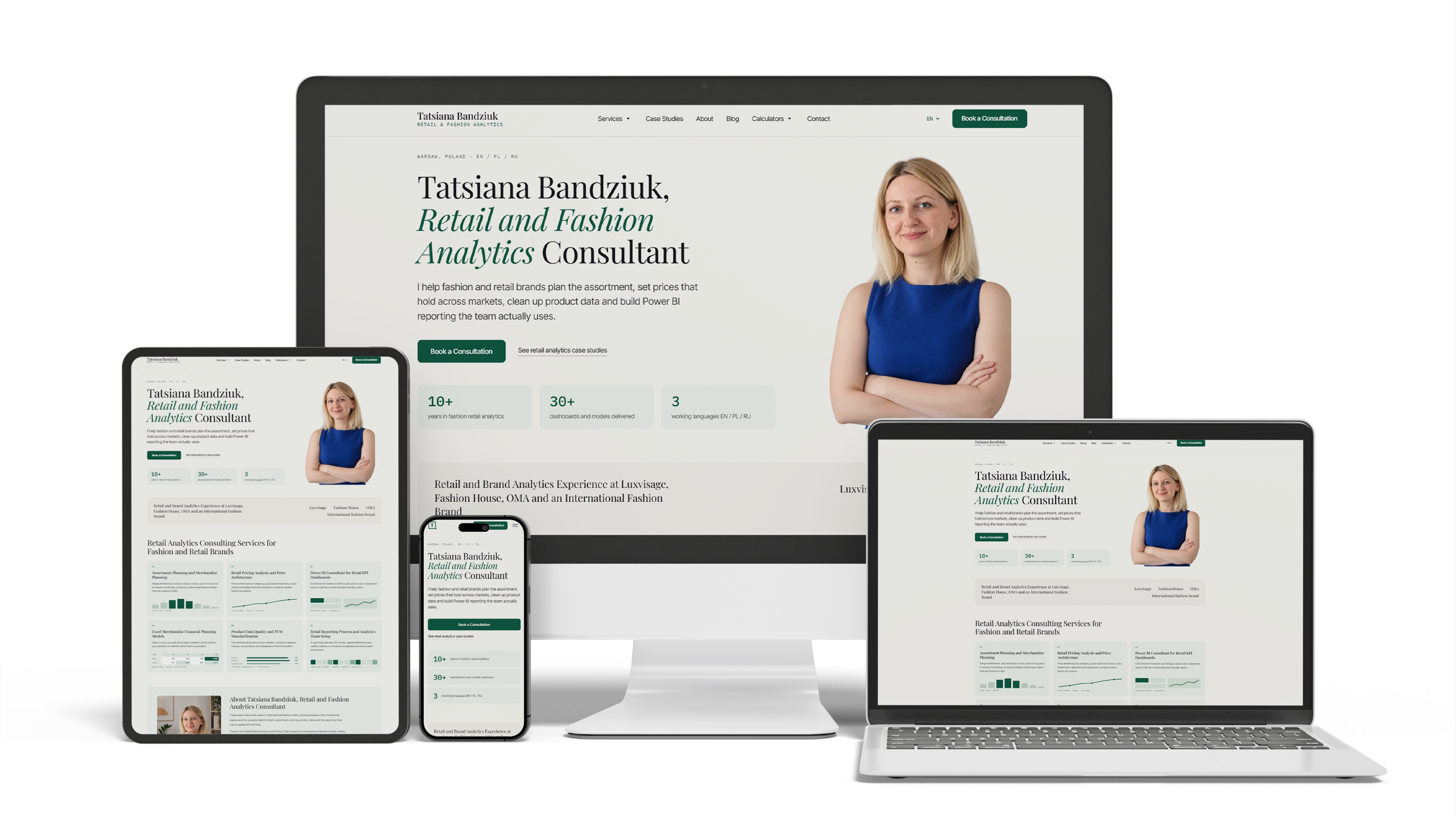
A retail and fashion analytics consultant — assortment, pricing, product data, Power BI reporting — had no website of her own. A search for her name returned social profiles and nothing else, so someone who had been recommended to her could not check her experience, see what problems people bring to her, or get in touch.
The brief was wider than a business card. The site had to be recognisable at a glance as an analyst's working environment: her clients live in Excel and Power BI, and speaking the language of their own tools proves the specialism faster than any paragraph. It had to bring people in from search, which meant researching what they actually ask before designing anything. And it had to be useful on its own — calculations on the page, templates to download and use, courses with video — a tool people come back to rather than a shop window for services.
Goal
- Design and build a consultant website that reads as a retail analyst's working environment
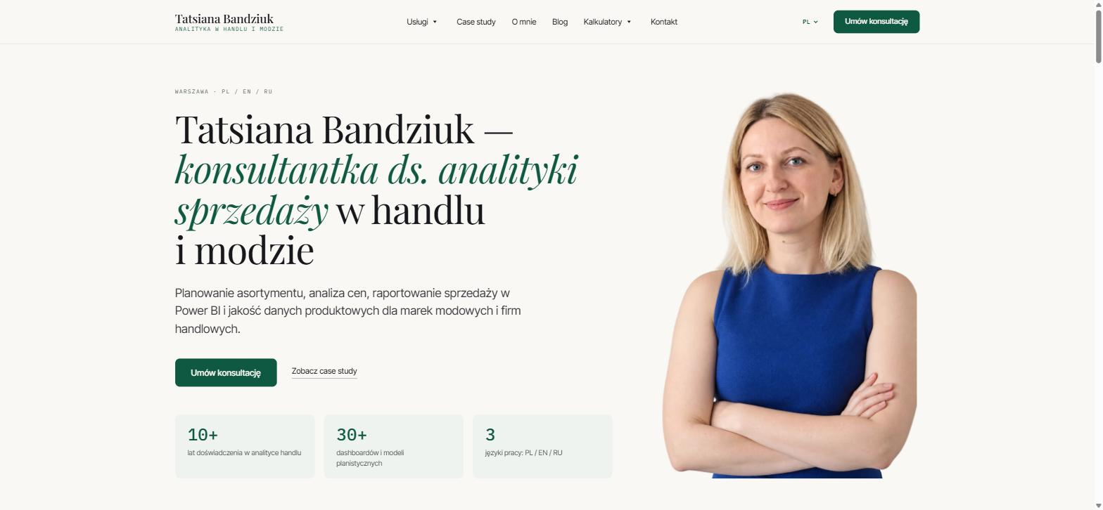
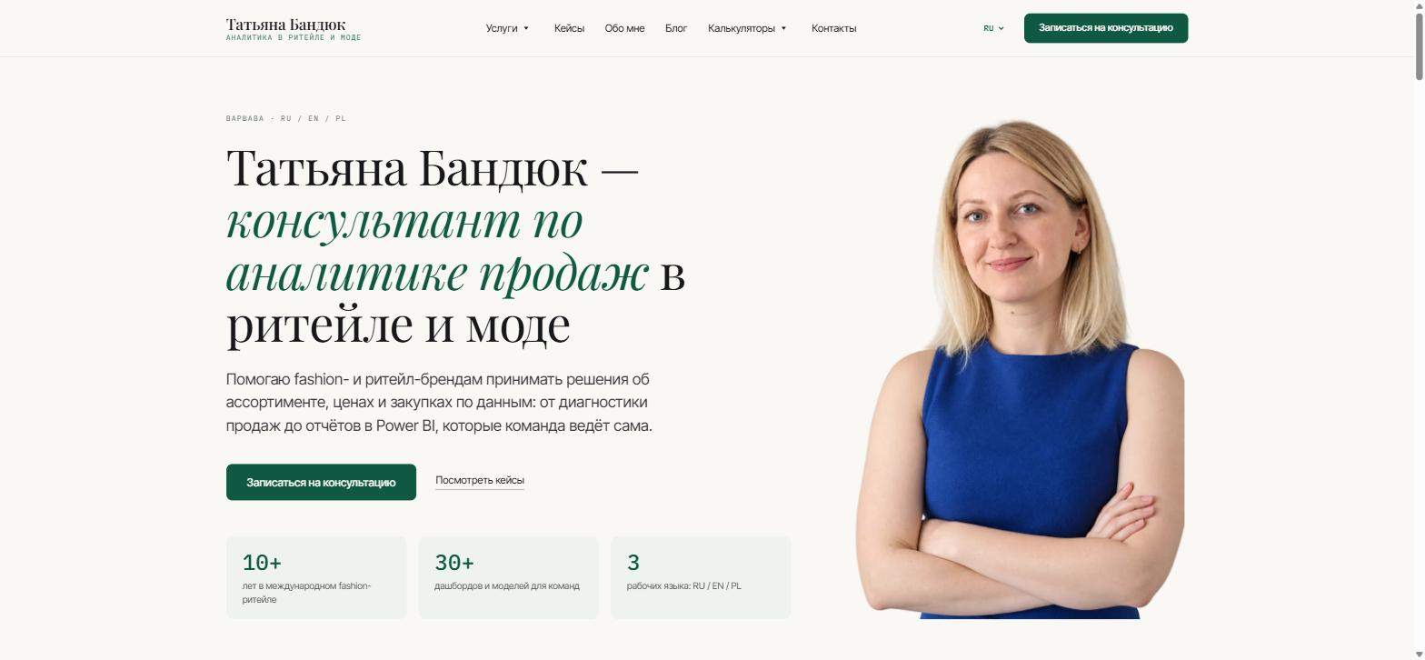
- Three languages: English for the UK and Europe, Polish and Russian
- Research search demand before designing, and build pages for what people actually ask
- Give visitors something useful on the site itself: calculators, downloadable templates, courses with video
- Prepare the site to be quoted by search engines and AI assistants
- Connect the site to email so enquiries and template requests arrive reliably
- Hand content editing to a CMS without making the site hostage to it
Results
- 153 pages: 52 in English, 51 in Polish, 50 in Russian
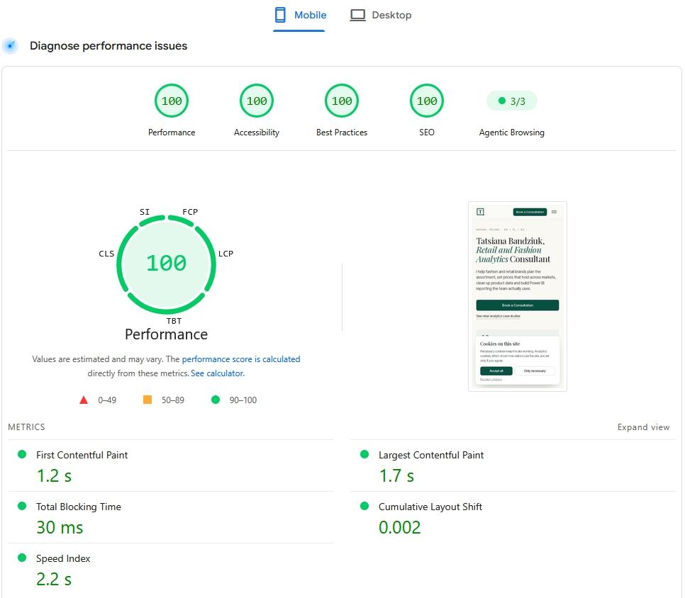
- PageSpeed Insights, mobile: 100 for performance, accessibility, best practices and SEO; readiness for AI agents 3 of 3
- 54 articles, 18 service pages, 18 case studies, 15 calculator pages, 18 blog categories
- 572 questions answered in the site's text: 205 in English, 188 in Polish, 179 in Russian
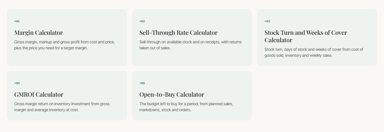
- Five retail calculators in three languages: margin and markup, sell-through, stock turnover, GMROI, open-to-buy
- Two Excel templates per language, with every formula checked by calculation rather than by eye
- Twelve page types, each with its own structured data
- Answers, figures and menus visible to search crawlers and AI assistants without running JavaScript
- New pages are announced to search engines automatically on publish
Completed Work
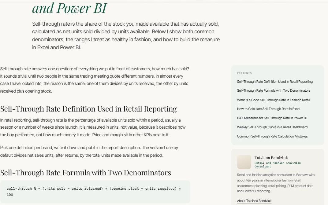
- The whole design concept: the site is built around interface patterns from Excel and Power BI
- Search demand research in three languages before the structure; every query group has its own page
- Copy written separately for each language rather than translated from English
- Development on Next.js with a Sanity CMS; pages are pre-built and refreshed once a day
- A fallback copy of all content inside the site: pages still build when the CMS is unavailable
- Three languages with translated section URLs, English without a language prefix
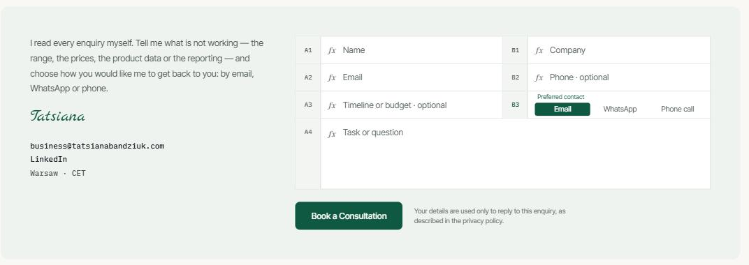
- A contact form designed as an Excel sheet: cell addresses, fill and a selection border
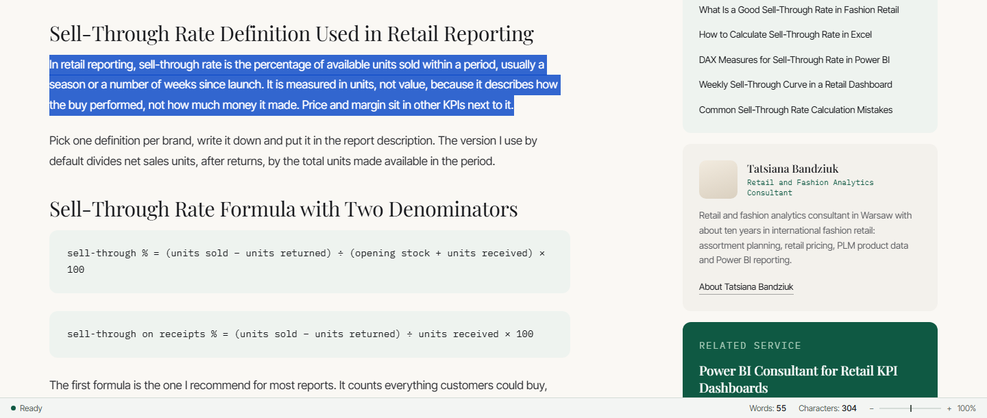
- A status bar at the bottom of the screen: a word count for selected text, a sum for selected numbers
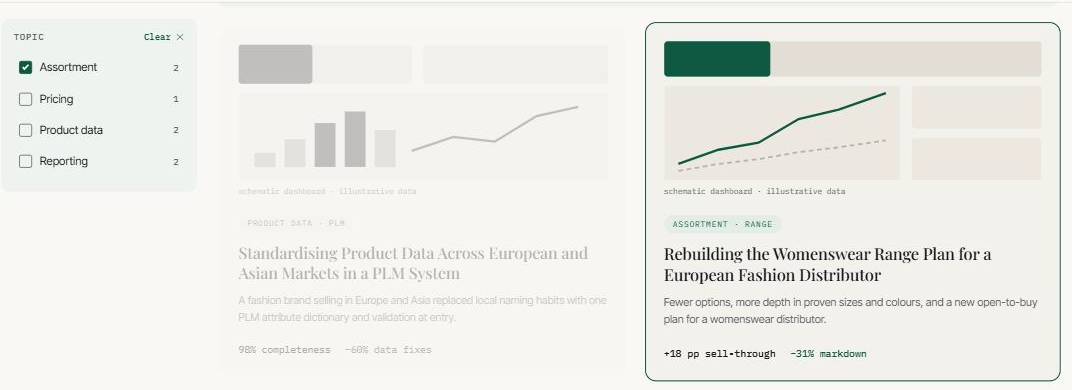
- A case study page that behaves like a Power BI report: choosing a topic highlights cards instead of hiding the rest
- Five calculators and two Excel models, built and verified by scripts
- Structured data written by hand for each of the twelve page types
- Links between pages built by meaning: a service, its case study, its articles and its calculators point at each other
- Enquiries and files sent by email, form spam protection without a captcha
Project Highlights

Project Description
What a consultant website has to do: prove expertise, earn search traffic and be useful first
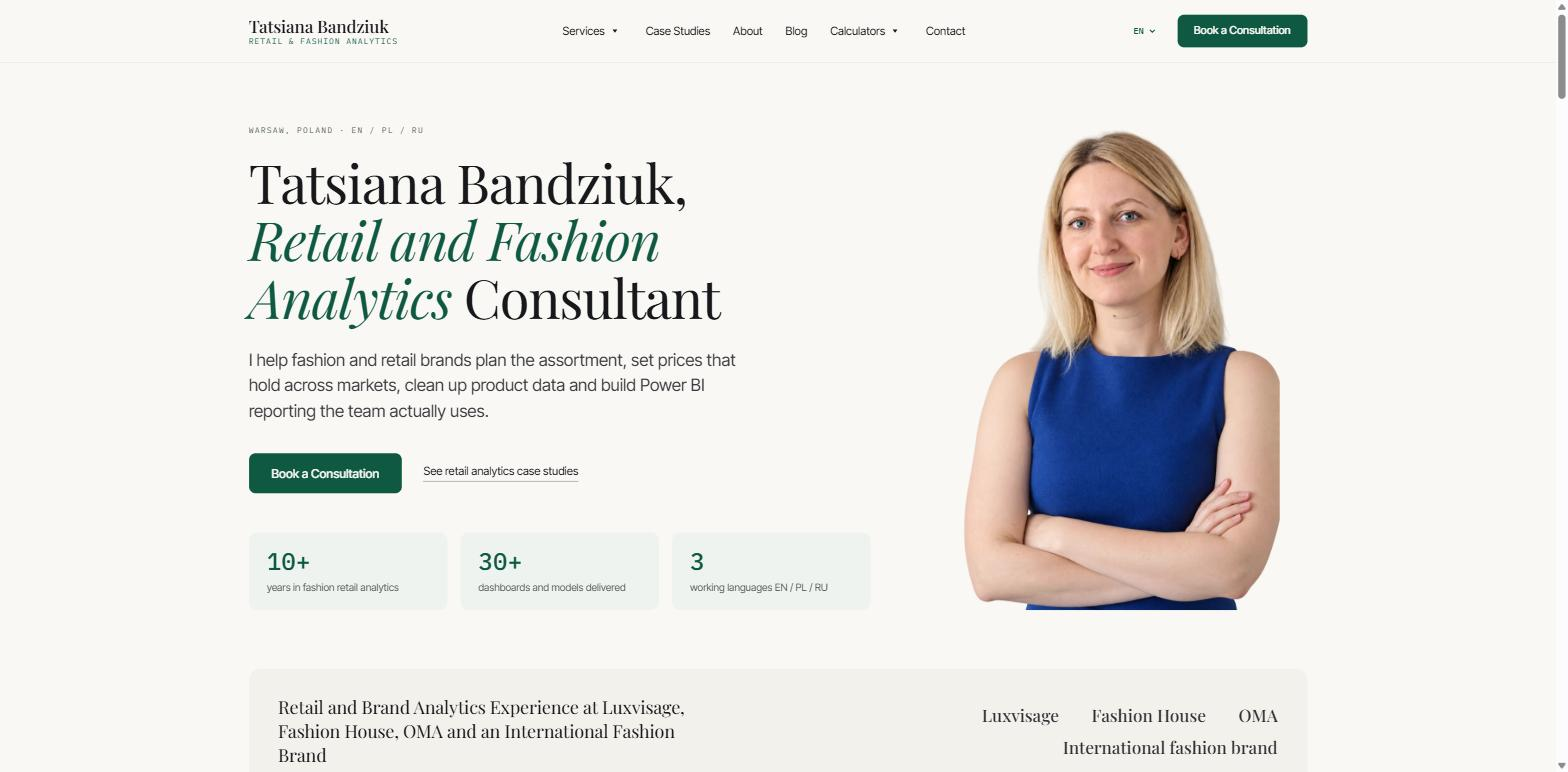
This is a consultant website built as a working tool rather than a brochure: 153 pages in English, Polish and Russian, five retail calculators, downloadable Excel templates and articles that open with the answer. It speaks the language of Excel and Power BI — the tools the consultant's clients use every day — and runs on Next.js and Sanity.
Most consultant websites follow the same pattern: services, experience, a contact form. That pattern works for someone who has already decided to get in touch. It does nothing for the person who is still working out their problem and is not ready to write to anyone yet.
So the site had three jobs. Show the expertise within seconds. Bring people in from search. And be useful before any enquiry, so that a visitor who is not ready to write still comes back. The third job shaped the whole structure: calculations that can be done on the page, templates that can be downloaded and used on Monday, articles that answer the question in the first paragraph rather than after three paragraphs of warm-up.
The first job got a direct answer. The consultant has spent ten years in Excel and Power BI, and so have her clients. The site can talk to them in the language of their own tools.
Search demand research for a consultant website in three languages
The structure was not invented. Before any page was designed, I looked at what people actually ask, and how, in each of the three languages. Four findings came out of it, and each one changed the project.
An AI answer appears on almost every target query. Of forty English queries checked, thirty-eight showed a ready-made answer block; in Polish, thirty-five of thirty-seven; in Russian, all thirty-six. The conclusion is uncomfortable but useful: the contest is not for a place in the list of links, it is for being quoted inside the answer.
Demand in the core niche is tiny. Queries about assortment planning run to single and double figures a month in all three languages. A site built only on them would get no visitors.
Mass demand sits in calculations. Far more people search for how to calculate margin than for an assortment consultant. That is why the calculators became pages of their own rather than widgets hidden inside articles.
Practitioners are missing from the results in every language. The top places belong to agencies, software vendors and general reference sites — people who write about this but do not do it. That gap became the site's positioning.
How a consultant website is built to be quoted in AI Overviews and ChatGPT answers
If a ready-made answer appears almost every time, the site's job is to be the source that is easy to quote. That is separate work, and this is what it consisted of.
The answer comes first. Every article and every calculator page opens with a direct answer to the main question in one or two sentences. The detail follows, but a person and a crawler both get the answer straight away.
Formulas and tables are text, not images. An image cannot be quoted; text can. Formulas sit in their own element on the page, and tables remain ordinary tables underneath all the styling.
Headings are written to stand alone. Every heading names its subject in full and works as an answer to a query, in all three languages.
FAQ answers are always in the page source. The question blocks are collapsed by styling, not loaded on click, so a crawler or an AI assistant sees them without clicking or running scripts. The same goes for figures, menu links and the language switcher.
AI assistants are let in; link-database crawlers are not. The crawlers of ChatGPT, Claude, Perplexity and the search engines move freely across the site. Commercial crawlers that collect data for other companies' SEO tools are blocked: they add load and bring neither readers nor citations.
New pages reach search engines at once. Publishing in the CMS tells search engines automatically that a new address exists, and every page in the sitemap carries its last-modified date.
How the same work applies to other sites is described under answer engine optimization.
Person and service structured data: how the site tells search engines who the consultant is
Besides the visible text, every page carries structured data — a block that search engines and AI assistants read to understand what they are looking at. It is usually added by a plugin and is the same on every page. Here it is written by hand for each of the twelve page types.
At its core are three descriptions repeated across the site: who this person is, which services she offers and what the site is. On top of them, each page type is described as what it is: a service as a service, a case study and an article as publications with an author and a date, a calculator as a free tool, and the About page with a list of diplomas, each with its year, type and issuer.
One decision deserves its own mention: the whole block is sent with the page, not drawn in by a script after it loads. AI assistants do not run scripts, and whatever appears only after them does not exist for them.
An Excel-style interface: a spreadsheet contact form and a status bar that sums selected numbers
The metaphor is carried by how elements behave, not by pictures.
The contact form is a sheet. Each field is styled as a cell with its own address: A1, B1, A2. When the cursor lands in a field, a light green fill runs across the cell from left to right and a green border sits on top of the grid lines — exactly like a selection in Excel. If a field is filled in wrongly, the same border turns red and the error text appears inside the cell in place of the label, so the page does not jump.
A detail I am pleased with: the function icon in an empty cell turns into an equals sign as soon as the field holds text. Cell addresses are calculated from the width of the block, not the screen, so the same form sits on the wide contact page and in a narrow pop-up, and the numbering looks right in both.
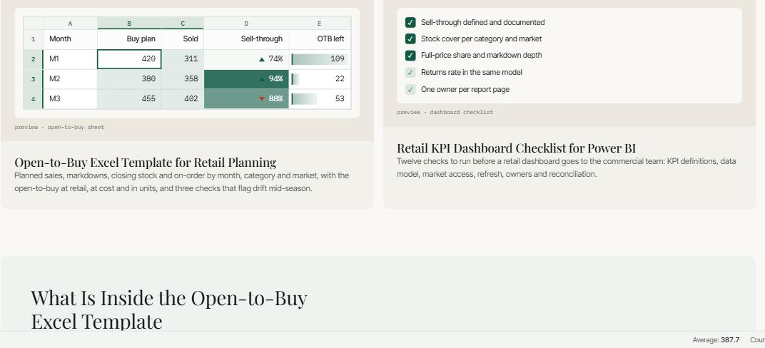
The status bar runs along the bottom of the whole site. Select a paragraph and it shows the number of words and characters. Select numbers in a table and it shows the average, the count and the sum, as in Excel. It is the most noticeable detail on the site, and it says "this is someone who works with data" without spending a single word of copy on it.
A case study page that works like a Power BI report: highlight instead of filter
Topics on the left, a chart and project cards on the right. Clicking a bar selects a topic, clicking again clears it, clicking with a modifier key adds a second topic — as in real reports.
The key difference from an ordinary filter: cards outside the selection do not disappear, they are dimmed. Cards in the selection are highlighted.
That is better for a visitor, who sees both the answer to their question and the whole body of work rather than a fragment of it. It is also better for search: every case study stays in the page source whatever is selected, because nothing is removed.
Charts on the consultant website render on the server and stay visible without JavaScript
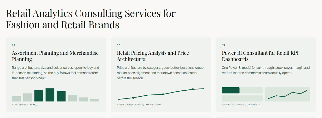
There are many charts on the site: a short sales line on the first screen, six mini-diagrams under the service cards, dashboard sketches on the case studies, article covers.
All of them are drawn in advance on the server and come to life through styling: the line draws itself, the bars grow from the bottom. If scripts do not run, the charts are simply shown drawn rather than missing. If the operating system is set to reduce motion, the movement is switched off entirely.
For a site that crawlers and AI assistants are meant to read, this is not a small thing: anything that appears only after scripts run does not exist for some of them.
Five retail calculators, each on its own page
Putting the calculators on pages of their own came from the demand research: people search for how to calculate margin far more often than for an assortment consultant.
There are five: margin and markup, sell-through, stock turnover, GMROI and open-to-buy. The calculation is written once; the languages are three.
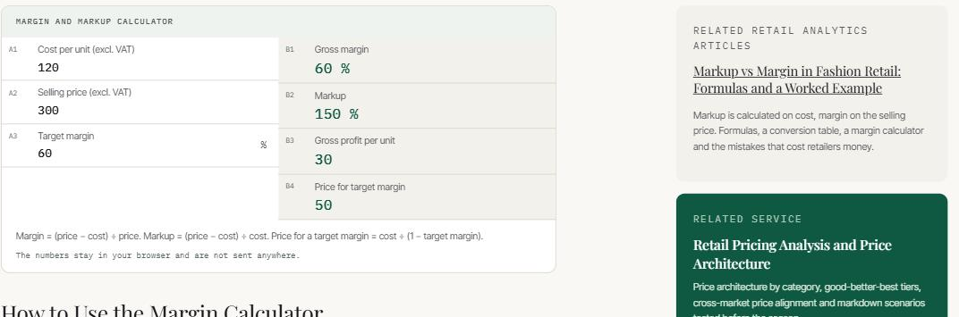
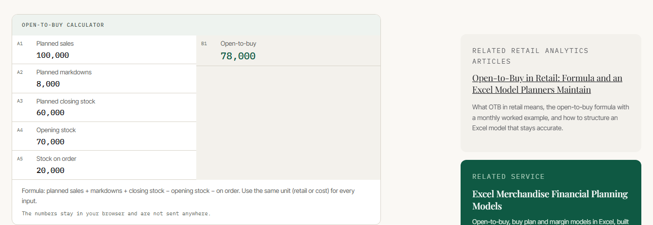
What separates a working calculator from a demo is detail. Fields are styled as spreadsheet cells, in the same logic as the form. Numbers are parsed by the rules of each language: in English the comma separates thousands, in Polish and Russian it is the decimal separator, and the spaces that number formatting inserts are caught separately. The result is announced to screen readers. On invalid input the result becomes a dash instead of showing "NaN".
Every calculator page follows the same structure: the calculation, how to use it, the formulas, a worked example, common mistakes, questions and answers. And directly under the calculator it says that the numbers entered are not sent anywhere.
Excel templates with every formula checked by calculation
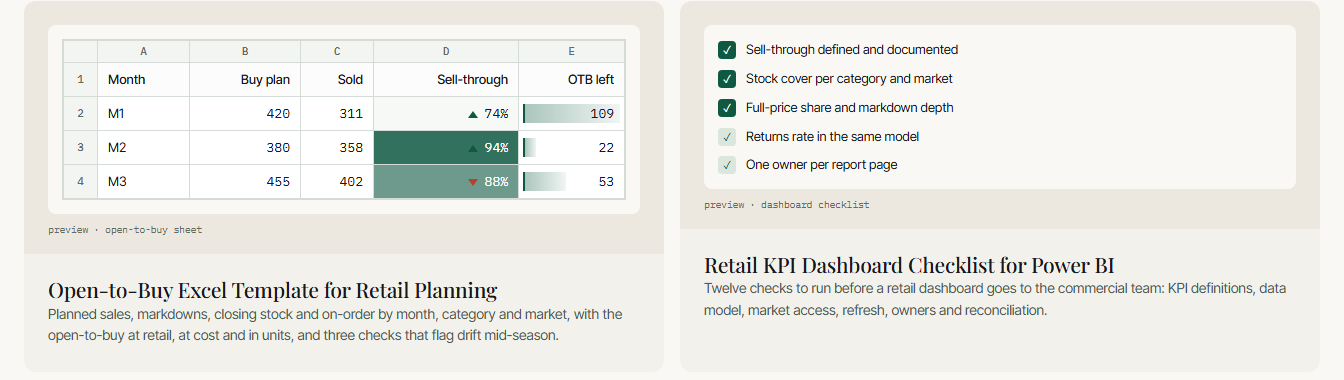
There are two templates per language: a purchasing budget model and a twelve-point checklist to run through before handing a dashboard to a commercial team.
The files were not put together by hand. They are generated by one script and checked by a second, which calculates every formula in the workbook and compares the result with a verified value. For a lead magnet that is unusual: it is usually a spreadsheet nobody has recalculated. Here an error in a formula cannot reach the person who will plan a purchase with it.
The model itself has three built-in checks — over-bought months, actuals not updated, sales deviating from plan — a definitions sheet and a one-page guide; input fields are highlighted in colour.
Why this consultant website is a tool rather than a brochure
The whole structure is built around one idea. Someone searching for how to calculate sell-through is not ready to write to a consultant — they are ready to calculate. The site lets them calculate. Someone building an assortment matrix is not ready to commission a project — they are ready to download a model. The site lets them download it.
That is why the site has a layer most consultants' sites do not: fifteen calculator pages, templates sent by email, a courses page with a waiting list, and video support inside articles. An enquiry and a template download are two different goals, and both are real: the second brings in someone who is not a client yet but already uses your tool.
The article format follows from the same idea: the direct answer first, then a breakdown with formulas, tables and embedded calculations. Across all 54 articles that adds up to 73 tables, 48 formulas and 21 embedded calculators.
Three languages, three markets: why the site was written, not translated
The demand research made it clear that translation would not work: people ask about different things in different languages, and a word-for-word copy of an English page would find no readers in Poland or among Russian speakers.
So the set of articles differs by language. Of twenty-five topics, fourteen exist in all three languages and ten exist in exactly one: in English, markdown strategy and the assortment planner's career; in Polish, category management and sales forecasting; in Russian, the assortment matrix and a breakdown of the buyer and category manager roles.
The same service is sold differently. The English Power BI page is built around "Power BI consultant", the main commercial query in that market. The Polish and Russian versions of the same service are sold as sales reporting, because that is how demand is shaped there.
URLs differ too: Polish ones without diacritics, Russian ones in Latin letters. Cyrillic URLs are avoided on purpose — when copied, they turn into an unreadable string of percent signs and digits. Section names in the URL are translated, not only the text.
The questions in the FAQ blocks come from what people actually ask in each language rather than being translated from English — 572 answered questions across the site.
How this works on other projects is described under multilingual website development.
Next.js and Sanity: fast pages that keep building when the CMS is down
All pages are built in advance and served ready, then refreshed once a day, so the site opens quickly however many pages it has.
Content is edited in Sanity, but the site does not depend on it: a complete fallback copy of the content lives inside the site itself. If the CMS is unavailable, pages still build — from the fallback. The CMS is the source of content here, not a single point of failure.
Images are served through a delivery network that picks format and size automatically, a YouTube video exists only as a cover image until someone presses play, and heavy animation libraries are used in exactly one place. Together that produces the speed a visitor notices as "the site just opened".
How enquiries and template requests from the site reach the consultant's inbox
The form collects a name, company, email, phone, timeline or budget, the preferred way of contact and the task itself. The chosen contact method decides whether the phone number is required.
The email reaches the owner with the sender's address as the reply-to, so she can answer straight from her inbox without copying anything. Template requests are handled separately: the visitor receives the files in a second email, in the language of the page they came from.
Spam protection works without a captcha — a captcha puts real people off and slows the page. Instead there are several invisible checks: a hidden honeypot field only bots fill in, a minimum time to complete the form, a limit on the number of submissions and a check that the request came from the site itself. If email is misconfigured, the site shows an honest error instead of pretending the enquiry was sent.
What is still left to do on the consultant website
The list is short and real.
When a link is shared in a messenger, the preview card is still empty — social images are needed. The structured data for the person and the articles still lacks photos, although the photos are ready. Articles' modified dates currently match their publication dates. Category, course and template pages still need structured data of their own.
On the interface side: the lightest shade of text falls below the contrast standard for small type, selecting a range in a table works only with a mouse, some labels for screen readers are not translated, and diploma scans are served without compression.
Recommendation blocks are built but switched off: they will appear once there are real reviews with permission to publish. Inventing testimonials for a site built entirely on verifiable data would be odd.