


Architecture Website Design
I design architecture websites and build them myself: project pages that tell the story of a brief with drawings and before-and-after views, filters by typology and place, team and process pages, and a portfolio that turns visitors into commissions.
- Portfolio that sells, built in
- From 700 €
- Reply within one business day
What you get with architecture website design
- Project pages that tell the storyBrief, site, constraints, drawings, result
- Filters by typology, place and statusA homeowner sees houses, a developer sees offices
- Plans, sections and before/after viewsReadable on a phone, zoomable on a desktop
- Team and process pagesWho designs, how the stages run, how to start
- Awards and press with sourcesA line on the project page, linked to the article
- A portfolio AI assistants can readProjects and services as text, not only images
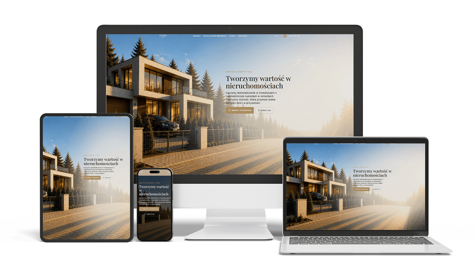
Renovation and investment website with a premium feel and 96/98/100/100 performance
96/98/100/100Design system2 languages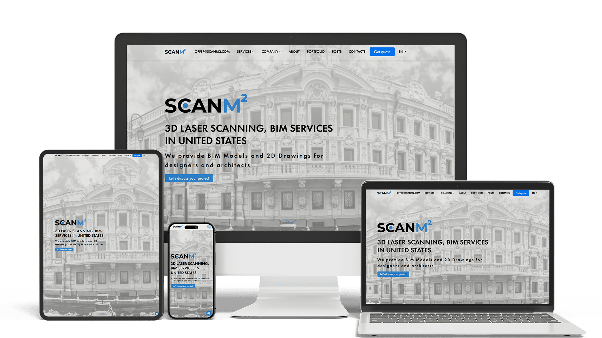
Architecture Website Rebuild and SEO
29× organic trafficLoads in under 1 sTop 3 in Poland
Full Multilingual Website Development & SEO for Student Services
+5,930 clicks in 6 months359k impressionsTeam edits it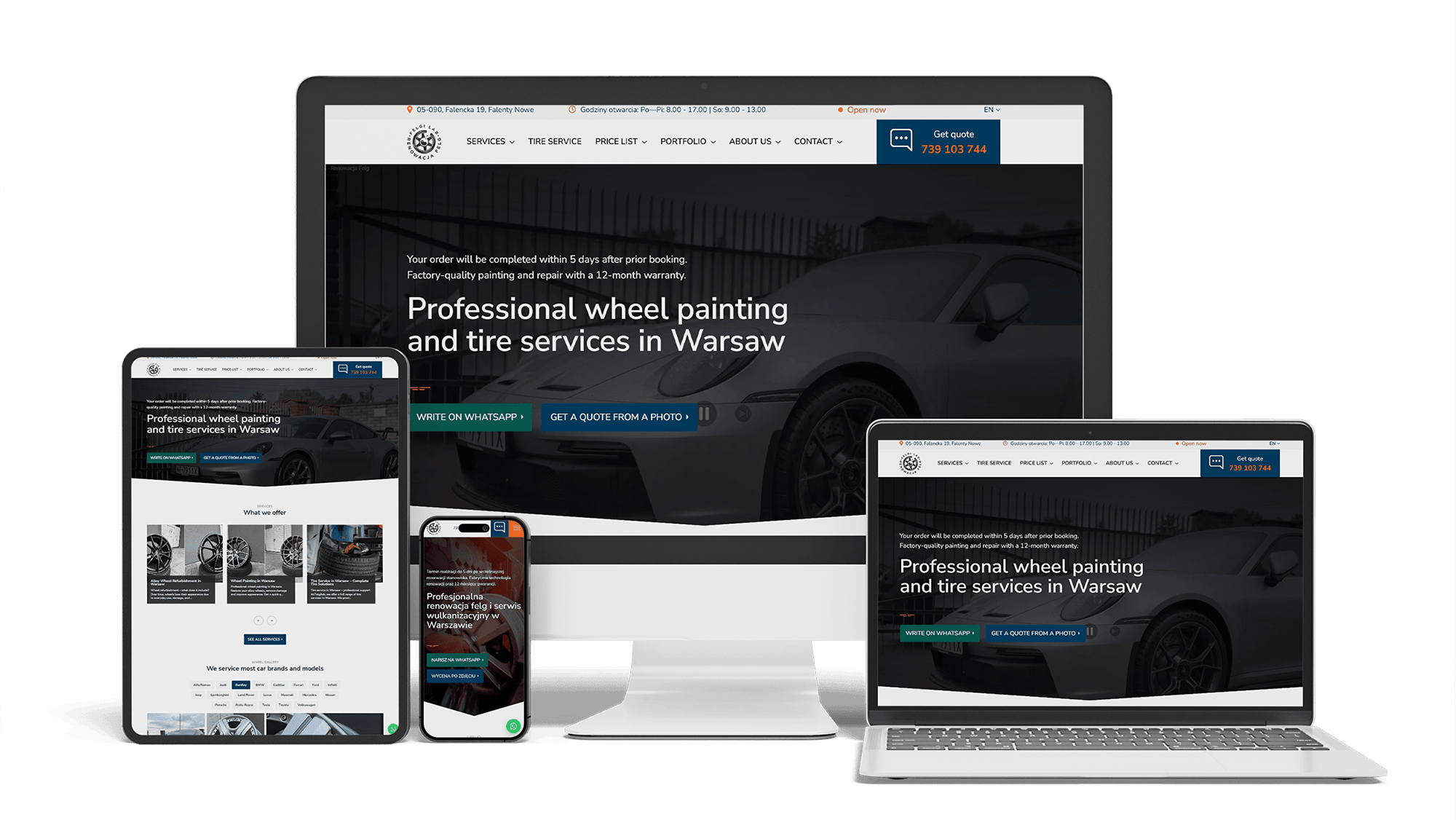
Full WordPress Rebuild for a Car Rim Restoration Company
92/91/96/100Photo quote formLocalBusiness markup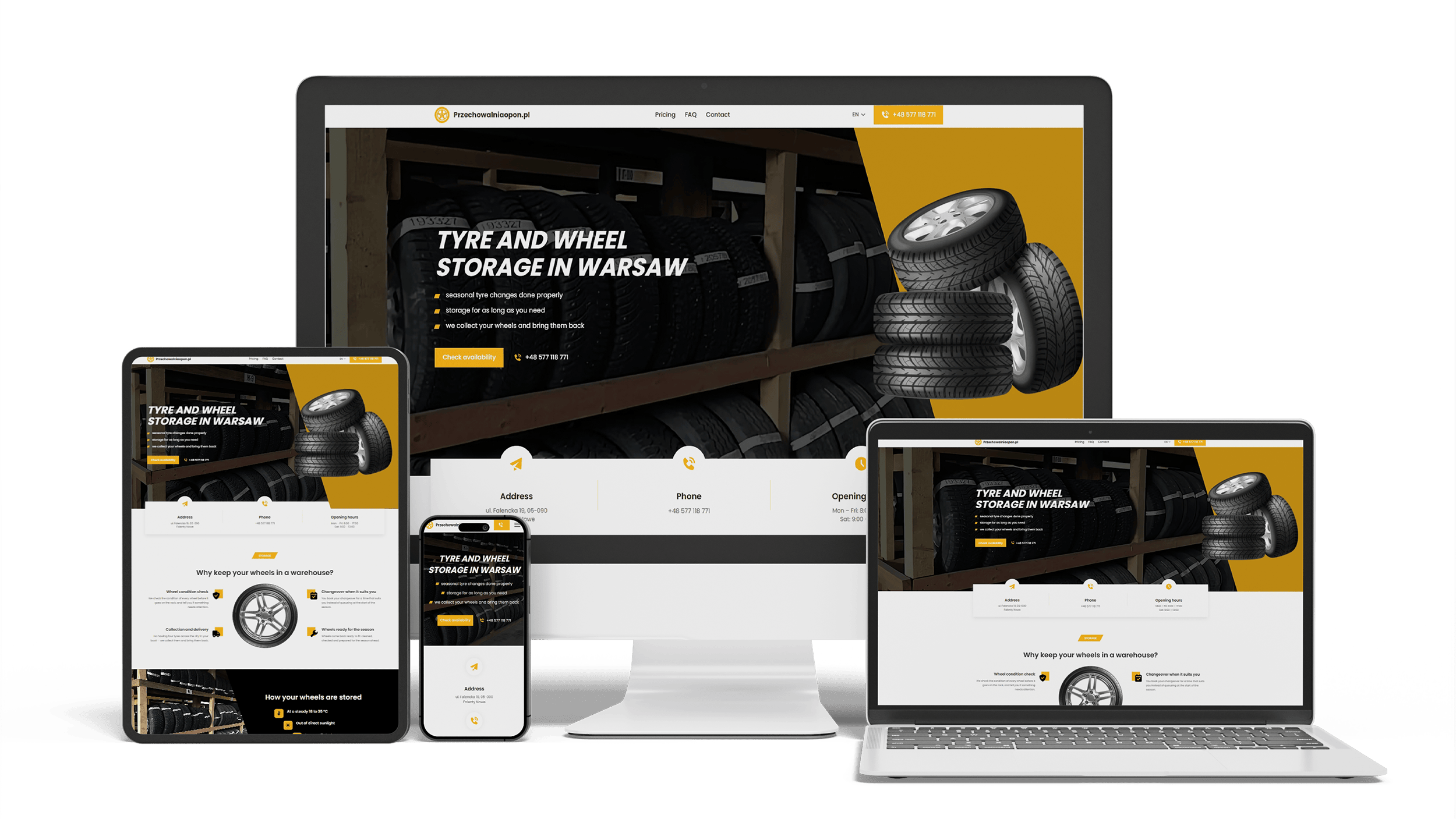
A multilingual landing page for a wheel and tyre storage business
100/95/100/1003 languagesClient edits it
Get a quote for your architecture website design
Within one business day I send a sketch of the home, project and team pages with a fixed price.
I offer architecture website design for studios, interior architects and landscape practices, and the same person — me — builds the site, so one price covers the design and the code. An architect’s website is a portfolio first, but a portfolio that sells: a future client should leave a project page knowing what the studio would do with a brief like theirs and how to take the first step.
Many architecture sites are made to impress other architects: a full-screen slideshow, a cryptic menu, project names that mean something only inside the office. A client about to spend years and a large budget with you is looking for other things:
- the kind of work you do and where, in one line on the first screen
- projects like their own within one or two clicks
- a picture of how working with the studio goes and what happens first
- a way to get in touch that does not require hunting for an email address
The visual quality stays — the work should look as good on screen as it does built — but every page also answers one of those questions.
The project page is where a visitor decides whether you are the right studio. I design it as a short story rather than a gallery:
- One strong image and a title with the building type and the place.
- The brief and the constraints of the site in a few sentences.
- Plans, sections or diagrams that carry the idea, readable on a phone and zoomable on a desktop.
- Before-and-after views for renovations and extensions, side by side or with a slider.
- Facts in a short table: area, year, materials, energy standard, team, photographer.
- Links to similar projects and a button to discuss a project of this kind.
High-resolution photography on a project page without a slow site
Large photos and quick pages can live together when images are prepared and loaded properly. The build side is described on the website for architects page. In the design it means choosing fewer, stronger images per project and letting drawings do part of the explaining.
A studio with forty projects needs a way to show the right five. Filters by typology — houses, housing, offices, education, interiors, landscape — by location and by status — built, in progress, competition — let a developer see only commercial work and a homeowner only houses. The chosen filter stays in the page address, so a link to “built houses in Colorado” can be sent in an email.
This is the part of the job that “website architecture design” refers to in the web sense: the structure behind the pages. On an architect’s site it decides how fast the right project is found, so it is agreed before any visual design starts.
Architects notice type and spacing, and their clients judge the site with the same eye. Choices I make together with the studio:
- one or two typefaces, often a neutral sans serif for text with a more distinctive face for headings
- a grid that respects the proportions of the photography rather than cropping every image to a square
- generous whitespace around images, and text set at a comfortable line length
- a restrained palette taken from the studio’s identity, with one color kept for buttons
- body text large enough to read on a phone without zooming
Minimal does not have to mean hard to use. Menus stay visible, labels stay readable, and buttons look like buttons.
Clients hire people. A team page with real portraits, roles, registration details and the projects each architect led works better than a grid of black-and-white faces without names. A process page walks through the stages — first meeting, feasibility, concept, permit drawings, technical design, construction — with what the client receives at each and roughly how long it takes. A studio page can show the office, physical models and sketches: work in progress says more about method than a mission statement.
Awards and features in architecture media are proof that clients understand. The design gives them a place without turning the site into a trophy shelf:
- a short line on the project page naming the award or publication and the year, linked to the source
- a press page listing each publication, the date and the article, as text
- publication logos only beside the matching text, never as an unexplained strip
Residential architecture websites
Homeowners compare houses, not concepts. Interior photography, before-and-after views, a plain description of the process and a first-meeting form that asks about the plot, the budget and the timeline.
Commercial and public-sector practices
Developers and public clients look for experience by sector and scale. Sector pages, project facts in tables, team credentials, and the frameworks or tenders you can name.
Architecture and interior design websites
Studios that do both need projects tagged by service, so a client who wants only an interior is not lost among buildings. Materials, furniture and supplier credits interest this audience.
Landscape architecture websites
Gardens and public spaces change with the seasons and the years. Pages that show the same place over time, planting plans and maps for large sites tell that story.
Architecture website design templates on Squarespace, Webflow, WordPress or Format are popular because their demos use beautiful photography and six neat projects. For a young studio they are a sensible start: low cost, quick launch, easy editing.
Limits appear as the portfolio grows: filters that cannot combine typology and location, project pages without room for drawings or facts, galleries that get heavier with every project, one language, little control over structured data. A custom design pays off when the studio has dozens of projects, works in several sectors or countries, or wants commissions from search. Leaving a template later means building again, so the choice is worth making early.
Collections of the best architecture websites and architecture website design inspiration on Pinterest, Archello or Webflow show striking home pages. Behind the ones that bring clients, the same patterns repeat:
- a first screen that says what the studio designs and where
- project thumbnails with the type and place written under each
- filters by typology and location
- project pages that combine images, drawings and a short text
- a contact button that stays in reach without covering the photography
- the same quality on a phone as on a large monitor
When you collect ideas, open a project page and the contact page on your phone, not only the home page on a desktop.
When someone asks ChatGPT, Perplexity or Google’s AI Overviews for an architect who designs a certain type of building in a certain place, the answer comes from text the assistant can read. A site where projects exist only as images, services sit in a PDF and the address appears only on an embedded map gives assistants nothing to repeat. The design keeps services, project types, places, team and awards as page text, with structured data for the practice and each project.
Being named in those answers is ongoing work, described on the AI SEO and GEO optimization page; being found in Google for your project types is covered on the SEO for architects page.
- Brief: the studio’s identity, the current site, the projects to show first and sites you like.
- Structure: menu, filters and page templates, agreed on a phone layout.
- Design: the home page, a project page and the team page in full; the rest follow the same system.
- Build and content: projects entered with texts and images, so the studio adds new ones itself.
The price covers both design and development:
- A simple architecture website with selected projects, a studio page and contacts: 700–1,400 €.
- A full site with project filters, project pages with drawings and before-and-after views, team and process pages and language versions: from 2,000 €.
Language versions follow the same design; the technical side is on the multilingual website development page. If the studio already has a site, its current URLs and positions are carried over by the website redesign process, and all ranges are on the pricing page.
Architecture website design: frequently asked questions
Order architecture website design: what to send me
A link to the studio’s current site or Instagram is enough to start; add the five to ten projects you want to show first, any drawings and photos you can share, the languages you need and two or three architecture sites whose look you admire or dislike. You get back a plan for the home, project and team pages and a fixed price. Use the form above or write on WhatsApp.