


Orthodontist Website Design
I design and build orthodontist websites: a first screen for parents and one for adults, braces and clear aligner pages, smile galleries with consent, cost and payment plan pages, an office finder and a referral form for general dentists — design and build from one person at one price.
- Parents and adults in one design
- From 700 €
- Reply within one business day
What you get with orthodontist website design
- Two front doors: parents and adultsKids and teens on one path, adult options on another
- Smile galleries with consent on fileSame angles and light, no retouching, case details
- Cost and payment plan pagesRanges, what is included, monthly plans as text
- An office finder for every locationDays open, doctors, parking and directions
- Referral form for general dentistsRecords through a provider built for health data
- Readable by Google and AI assistantsTreatments, offices and ages treated as text
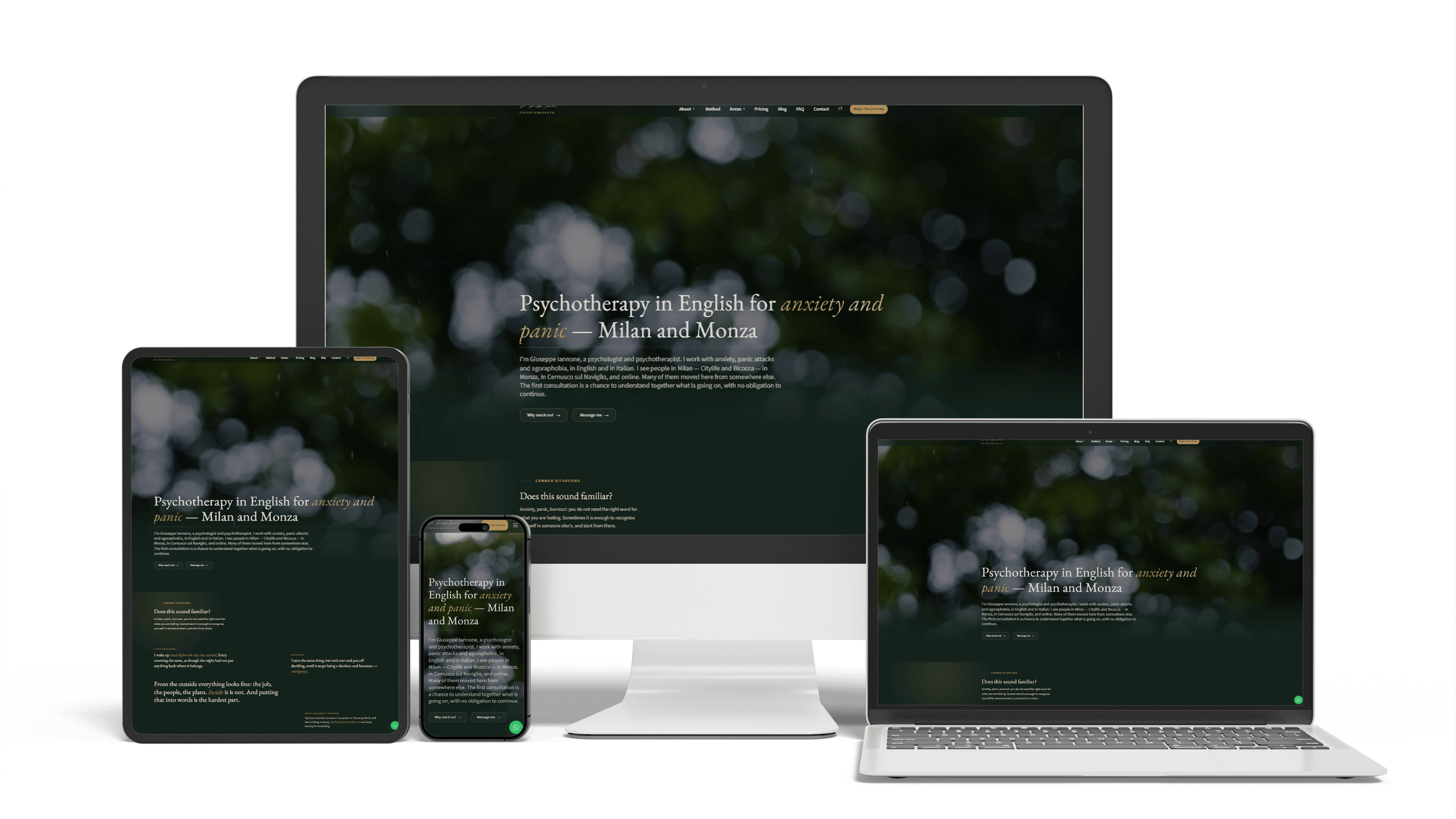
Bilingual psychotherapist website in Italy
468 of 468 posts moved2 languagesSeen in ChatGPT answers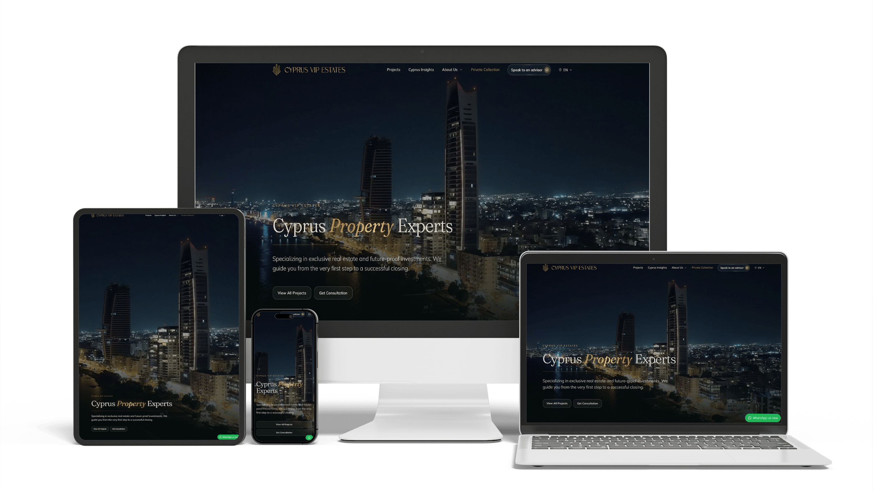
Multilingual real estate platform in Cyprus: SEO and GEO without bought links
16× faster editingTraffic from ChatGPTLeads via WhatsApp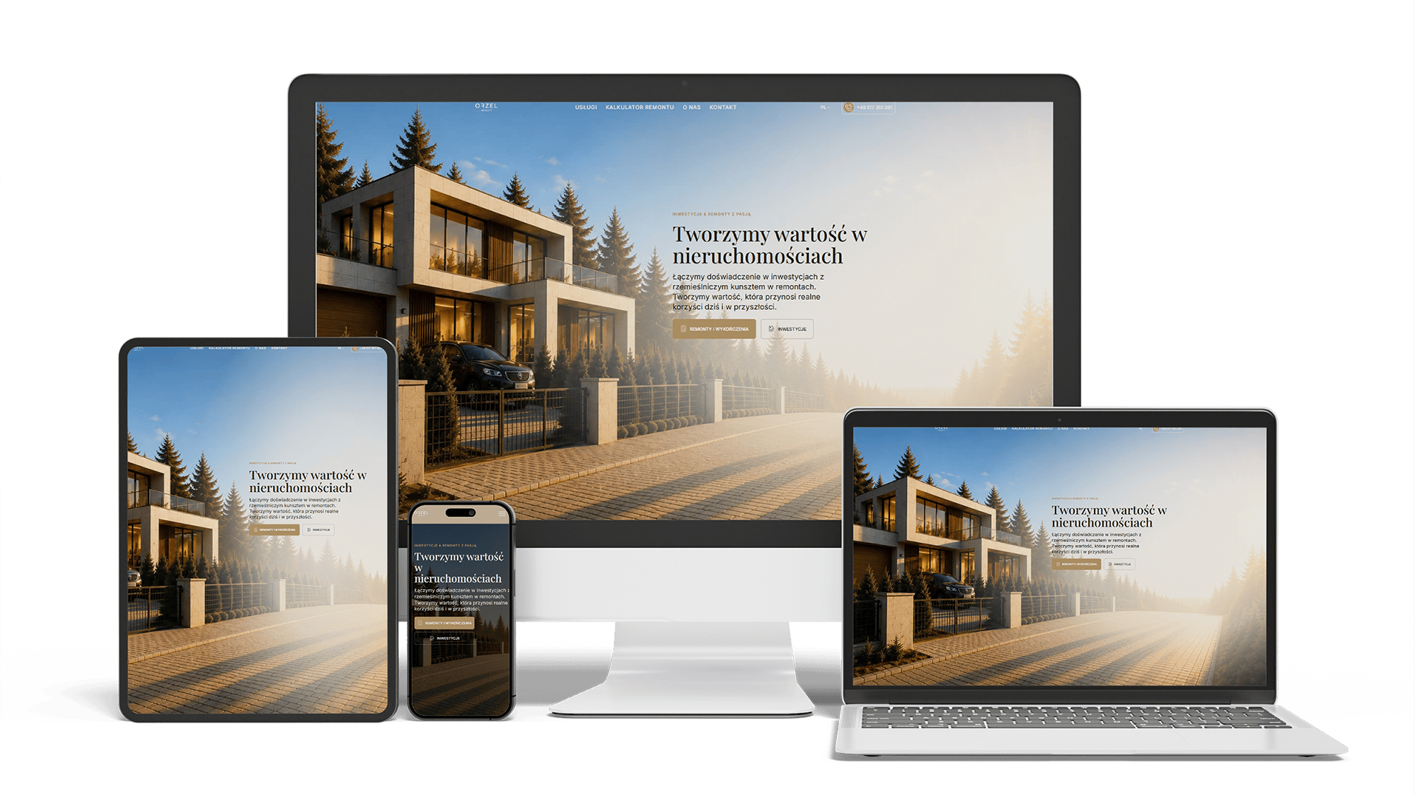
Renovation and investment website with a premium feel and 96/98/100/100 performance
96/98/100/100Design system2 languages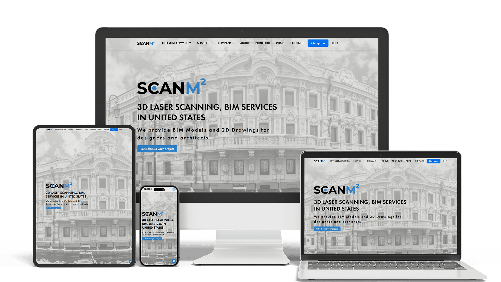
Architecture Website Rebuild and SEO
29× organic trafficLoads in under 1 sTop 3 in Poland
Full Multilingual Website Development & SEO for Student Services
+5,930 clicks in 6 months359k impressionsTeam edits it
Get a quote for your orthodontist website design
Within one business day: what the home screen should say to parents and to adults, a list of pages and one fixed price.
I design orthodontist websites and write their code myself; there is no hand-off between a designer and a developer, and the quote is a single figure. An orthodontic site serves two very different visitors — a parent deciding about a child’s treatment and an adult who wants straighter teeth without anyone at work noticing — and both have to reach a consultation request without hunting for it.
The home page gives each visitor a door. One block for “Braces and early treatment for children and teens”, one for “Clear aligners and discreet braces for adults”, a single consultation button and the phone number under both. Below that, one line each: the orthodontist’s name and specialty, the offices, and how payment works.
Stock photos of grinning teenagers and moving sliders do not belong here. A photo of your own treatment room and team, in natural light, tells a parent more about the practice than any slogan, and a calm layout with one accent color for the booking button keeps attention where it should be.
Parents read on phones, often in the car outside school. A child’s treatment is easier to follow as a timeline than as paragraphs: first check, observation visits if it is too early, a first phase if needed, braces or aligners, then retainers. I design it as a row of short steps, each with the usual age range and how often the family comes in, written and dated by your orthodontist.
The first-visit page shows what happens in the chair, how long it takes, whether a parent can stay and which records are taken. These are the details that decide whether the parent of a nervous ten-year-old calls.
Adults compare options side by side, so a comparison table does more than three separate sales pages: visibility, typical length range, visit frequency, eating and cleaning, what the patient has to do every day. Each column links to the full page for that option, with the orthodontist who provides it.
The adult section uses photos of adult patients, shared with consent, not teenagers, and offers a way to ask a question in writing for people who cannot call during work hours. Discretion is part of the design, not only of the treatment.
The gallery is the most visited page on many orthodontic sites, and its design keeps it honest:
- written consent for every case, signed by a parent or guardian for minors, kept in the practice records
- the same views — front, both sides, bite — and the same lighting before and after
- no retouching, whitening or cropping that hides crowding
- the treatment and its length next to each case, and a plain note that results vary
- filters by treatment and age group, so an adult does not scroll through teenagers
- image descriptions that name the case type for screen readers, never the patient
Cost works best as a set of cards: one per treatment, each with a price range, what it includes and a sample monthly plan. A payment calculator can help if it shows ranges and states its assumptions; it must never look like a quote. Insurance and flexible spending accounts get a short, plain paragraph rather than a wall of logos.
If your consultation has no fee, the card says what it includes, right beside the button. How such offers may be worded depends on your state board, so check before launch. Giuseppe, a psychotherapist in Milan, works under article 40 of the Italian psychologists’ code of conduct, so his editor flags any draft that promises an outcome, quotes a patient, mentions a discount or offers a “free consultation”. A similar check can flag the phrases your own board restricts.
Every page leads to the consultation request. On a phone it stays within thumb reach in a bar pinned to the bottom of the screen, next to the phone number. Tapping it opens your scheduling system’s online booking, or a short request form asking for a name, contact details, the patient’s age group and the preferred office — nothing clinical.
Virtual consultations, where a patient uploads photos of their teeth, suit adults and families far from an office. Those photos are health information, often of a child’s face, so they go through a service that has signed a HIPAA business associate agreement with the practice, never through email or an ordinary form. I design the flow around the provider you choose, and your compliance adviser approves it. Five years ago I helped build a system for patient records, under an NDA that keeps its name private; it taught me to let a public website store nothing clinical it can do without.
Practices with several offices need an office finder: a map and a list, each office with its own page showing the days it is open, the orthodontists who treat there, parking, the entrance and a photo of the front door. Families choose by the school run, so the list can show nearby towns, and the request form asks which office suits them.
Giuseppe’s site follows the same pattern on a smaller scale: one map showing where he sees clients — Milan, Monza, Cernusco sul Naviglio — a page for each place and a separate page for online sessions with Italians abroad.
Parents and dentists both read the doctor page. It shows the dental degree, the specialty residency, board certification where it applies, years in practice and the offices where the orthodontist sees patients, with a real portrait. Assistants and coordinators get a photo and a line each; families meet them more often than the doctor.
Referring dentists get a small section of their own: how to refer, a form that sends records through a secure provider, what you report back after the first visit and a direct number. Two pages save a busy dental office a phone call for every referral.
Patients in treatment visit the site more often than new ones. A section for them keeps the home page clear and reduces calls: what to do about a poking wire or a loose bracket, which problems need a call the same day, cleaning around braces, how long to wear aligners and how to clean them, retainer care, and the link to the patient portal or payments. Short videos recorded by your own team work better here than stock footage.
Parents ask AI assistants which orthodontist nearby treats young children, has evening hours or offers monthly plans. The replies are assembled from page text the assistant can parse and compare with your Google profiles. The design keeps those facts in the page itself, not inside images: offices with days and hours, ages treated, treatments, languages, payment options, and structured data that connects each orthodontist to each office. Giuseppe’s site follows the same rule, and ChatGPT is already quoting pages he published after launch.
Keeping the practice in those answers month after month is a separate service: see the AI SEO and GEO optimization page. For Google rankings on braces and aligners in your area, see SEO for orthodontists.
Dental marketing platforms sell orthodontic templates with stock content, hosting and a few tools in one subscription. For a single new office that mostly needs hours and a phone number, that is a reasonable start. The limits appear later: text shared with many other practices, galleries without filters, no real office pages, and a contract under which the site stays with the vendor.
Leaving is where practices fear losing their rankings. Giuseppe’s site went from WordPress to Next.js with all 468 blog posts carried over and a 301 redirect for each old URL; galleries and office pages of an orthodontic site can be carried over the same way. The website redesign page describes the process.
There is no separate design fee: one figure covers the layout and the build.
- A compact site for one office — home, treatments, the orthodontist, cost cards and online booking: 700–1,400 €.
- An orthodontist website with parent and adult paths, aligner and braces pages, a filtered gallery, cost and payment plan pages, office pages and a referral form: from 2,000 €.
Giuseppe’s project took 44 working days between the start of coding and handing the site over, with written manuals in two languages and recorded walkthroughs. My general build process is on website development; for general dentistry see dental website design, for other specialties medical website design, and every price list is on the pricing page.
Orthodontist website design: frequently asked questions
Order orthodontist website design: what to send me
Tell me your practice name and current site, each office with its open days, what you treat in children and in adults, your booking software, and attach a few photos of the team and treatment rooms. I answer with a home-screen sketch and a fixed price. Use the form above or write on WhatsApp.