


Financial Advisor Website Design
I design financial advisor websites and build them myself: a first screen that says who you serve and how you are paid, credential and team pages, disclosure slots your compliance team can approve, and scheduling and client login one tap away.
- Design + build, one price
- From 700 €
- Built for compliance review
What you get with financial advisor website design
- “Who we serve” pages for each nichePhysicians, business owners, retirees, expats
- A plain-language fee pageHow you are paid, minimums, what a fiduciary means here
- Advisor photos and credentialsCFP®, CFA and licenses as text beside each name
- Disclosure slots and a review linkYour compliance team approves before anything goes live
- Scheduling and client loginIntro-call booking and portal links in the header
- Readable by Google and AI assistantsNames, credentials and services as page text
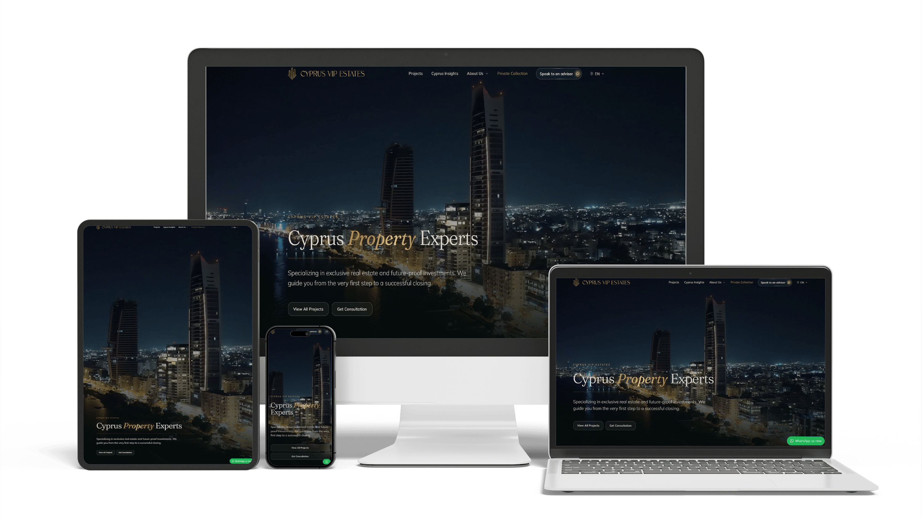
Multilingual real estate platform in Cyprus: SEO and GEO without bought links
16× faster editingTraffic from ChatGPTLeads via WhatsApp
Renovation and investment website with a premium feel and 96/98/100/100 performance
96/98/100/100Design system2 languages
Full Multilingual Website Development & SEO for Student Services
+5,930 clicks in 6 months359k impressionsTeam edits it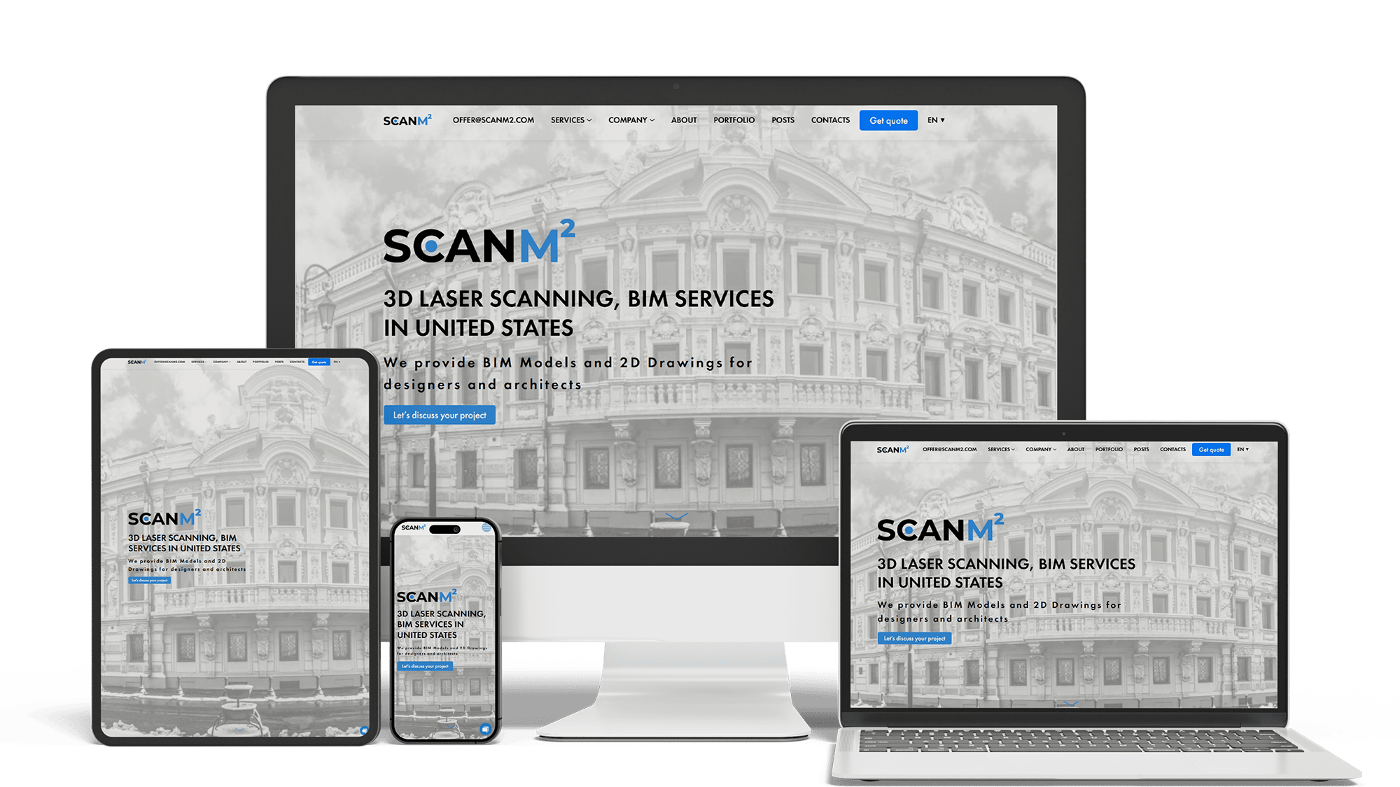
Architecture Website Rebuild and SEO
29× organic trafficLoads in under 1 sTop 3 in Poland
A multilingual landing page for a wheel and tyre storage business
100/95/100/1003 languagesClient edits it
Get a quote for your financial advisor website
I reply within one business day with a plan for the home, who-we-serve, fee and team pages and a fixed price.
I design financial advisor websites and build them myself, so the structure, the design and the build come from one person at one price. A prospect who finds an advisory firm is about to hand over retirement savings, the proceeds of a business sale or a family’s plan for the next twenty years. Before booking a call they check three things: whether you work with people like them, how you are paid and whether the person behind the site is real and qualified. The design is built around those three checks.
The home page of most advisory firms opens with a sailboat, a couple walking on a beach or a compass and a slogan about “your financial future”. A visitor learns nothing from it. The first screen I design answers these questions before any scrolling:
- who you serve — “Financial planning for physicians in Ohio” or “Retirement income for federal employees”, not “Helping you reach your goals”
- how you work — fee-only, fiduciary, flat fee or a percentage of assets, in one line
- who the advisor is — a real photo and a name with credentials
- what to do next — a button that books a short intro call, with the phone number beside it
The client login sits in the top corner, where existing clients look for it, so it never competes with the button meant for prospects.
A site that turns visitors into intro calls needs a small set of page types, each built as its own template:
- “who we serve” pages, one for each kind of client you focus on
- services and process: what planning, investment management and ongoing reviews include, step by step
- fees: how you are paid, account minimums and what the first meeting costs
- team pages with credentials, licenses and a short personal story
- articles or market notes with the author and the date
- disclosures: the firm’s regulatory status, links to Form CRS and the ADV brochure where your firm uses them, a BrokerCheck or adviser search link, and a privacy notice
Nothing on this list needs to be long. It needs to be easy to find, and each piece has a fixed place in the layout so the next update does not break the design.
Advisors who name a niche tend to get prospects who already feel understood. Each niche page follows the same pattern — the client’s situation in their own words, the questions you solve, a typical engagement and a booking button — but the content and the photos change.
Physicians and dentists
Student debt, late starts on saving, practice ownership and disability coverage. Short blocks, because these readers check the site between appointments on a phone.
Business owners
Retirement plans for staff, succession and the sale of the company. A layout that links to case-style process descriptions works better than emotional imagery.
Retirees and pre-retirees
Income planning, Social Security timing and required distributions. Larger type, high contrast and a phone number that stays visible.
Expats and cross-border families
Accounts in two countries, two tax systems and often a second language. A language switch on the first screen and pages written by a person, not a widget; the technical side is on the multilingual website development page.
Fees are the question prospects are most hesitant to ask on a first call, so the site answers it first. A fee page I design has a short explanation of how you are paid, a simple table — flat planning fee, ongoing advisory fee, minimums — and a plain sentence on what is not included. If you charge a percentage of assets, the table shows how it is calculated rather than one headline number.
“Fiduciary” and “fee-only” are strong words when they are true for every service you offer and a problem when they are not. The design gives them a place on the first screen and the fee page; which words you use, and with what qualification, is your compliance team’s decision.
People choose an advisor more than a firm, and the team page is where they do it. Each profile follows the order of the visitor’s questions:
- A portrait in the same light and framing as the rest of the team.
- The name, role and designations — CFP®, CFA, CPA, EA — written as text.
- Who this advisor works with and why, in two or three sentences.
- Licenses and registrations, with a link to the public adviser or broker search where it applies.
- A direct button to book a call with this advisor.
Designations follow the usage rules of the bodies that grant them; CFP Board, for example, publishes guidelines for the CFP® marks. Keeping credentials as page text rather than badges in an image also lets visitors and search engines read them.
In the US an adviser’s website is advertising. The SEC Marketing Rule allows testimonials, endorsements and performance figures under conditions — disclosures next to a testimonial, net-of-fee figures and set time periods for performance among them — and broker-dealer communications fall under FINRA rules. Rules in the UK, Canada and Australia differ again. The design does not decide what you publish; it makes room for whatever your compliance team approves:
- a testimonial card with a disclosure field attached to it, not a footnote at the bottom of the page
- a review section that can be switched off without leaving a hole in the layout
- a fixed disclosure area in the footer and on every article
- no performance charts unless your compliance team asks for them and supplies the figures
I am a designer and developer, not a compliance officer; check every rule with your compliance team or broker-dealer.
At many firms, changing one sentence on the website takes weeks because nobody knows where the approved version is. The build fixes the process, not only the pages:
- a private staging link where your compliance team reviews every change before it goes live
- roles in the editor, so advisors can draft but only an approver can publish
- a change history for each page, with the date and the person
- pages that your archiving service can capture, because firms usually have to keep copies of what they published
Advisors affiliated with a broker-dealer often need its approval for every change, and some broker-dealers accept only sites from approved vendors. Check that before we start.
The booking button opens the scheduling tool you already use, such as Calendly, with a few questions about the prospect’s situation. The form never asks for account numbers, Social Security numbers or statements; sensitive documents belong in the secure portal once someone becomes a client. The “Client login” menu links to the custodian and planning portals your clients actually use, each labeled by name.
Many advisory clients are older, and in the US accessibility claims under the ADA reach financial firms too. The site is built against WCAG 2.1 level AA: readable type sizes, enough contrast, labeled form fields, keyboard navigation and captions for any video.
Financial advisor website providers — Twenty Over Ten, Advisor Websites, FMG and similar platforms — offer templates, content libraries and, in some cases, a review workflow connected to certain broker-dealers. For a new practice, or an advisor whose broker-dealer requires an approved vendor, a provider is a sensible choice and often the best website builder for financial advisors in that position.
A custom design pays off when you have a defined niche, several advisors, a second language or a site that looks like every other one built on the same template. The site is yours: the domain, the code and the content, with no platform fee. Moving from a provider keeps your addresses and rankings through the website redesign process.
Lists of the best financial advisor websites mix national firms with solo planners. Set the budgets aside, and the same patterns appear in the strongest financial advisor website examples:
- a niche named in the first sentence
- real advisors on the home page, not models
- fees explained on the site before any call
- one booking button repeated through the page
- calm colors with one accent reserved for actions
- articles that show the date and the author’s credentials
When you look at examples, open the fee page and a team profile, not only the home page. That is where a prospect decides.
People ask ChatGPT, Perplexity and Google’s AI Overviews to find a fee-only planner who works with teachers or an advisor who understands US and UK pensions. Google treats financial content as “Your Money or Your Life” and holds it to a higher standard, and AI assistants lean on the same trust signals. The design keeps the facts readable: names, designations, niches, locations and the firm’s regulatory status as text, structured data for the firm and each advisor, and an author and review date on every article.
Being named in those answers is ongoing work, described on the AI SEO and GEO optimization page. Getting found in Google is covered on the financial advisor SEO page.
Design is not sold separately: the price covers design and development.
- A simple financial advisor website — home, services, fees, team, contact and booking: 700–1,400 €.
- A site with who-we-serve pages, fee and credential pages, disclosure slots, a review workflow, scheduling and client login links: from 2,000 €.
The work runs in four steps: a brief with your niche, team and compliance contact; a phone-first structure of the home, a niche page and a team profile; the full design of those pages; and the build, compliance review and launch.
How I build websites in general is on the website development page, and all price ranges are on the pricing page.
Financial advisor website design: frequently asked questions
Order financial advisor website design: what to send me
Send a link to the firm’s current site (or just its name), the kinds of clients you focus on, how you are paid, the number of advisors and whether you are an RIA, a hybrid or affiliated with a broker-dealer. A few advisor sites you like or dislike and the name of your compliance contact help me plan the review step. I will reply with a plan for the home, who-we-serve, fee and team pages and a fixed price. Use the form above or write on WhatsApp.