


Dental Website Design
I do dental website design and build the site myself: a calm look for nervous patients, real photos of your team and office, separate paths for new patients and emergencies, and a booking button where the thumb already is.
- Design + build, one price
- From 700 €
- Reply within one business day
What you get with dental website design
- A calm design for anxious patientsSoft color, plain words, nothing clinical on the first screen
- Your team and your office, not stock smilesA shot list for the dentists, hygienists and rooms
- Before-and-after smile galleriesShown with written patient consent, captioned plainly
- New-patient and emergency pathsBooking for one, a phone number for the other
- Accessible for older patientsContrast, text size and tap targets checked against WCAG
- Readable by Google and AI assistantsTreatments, insurance and hours as text, not pictures
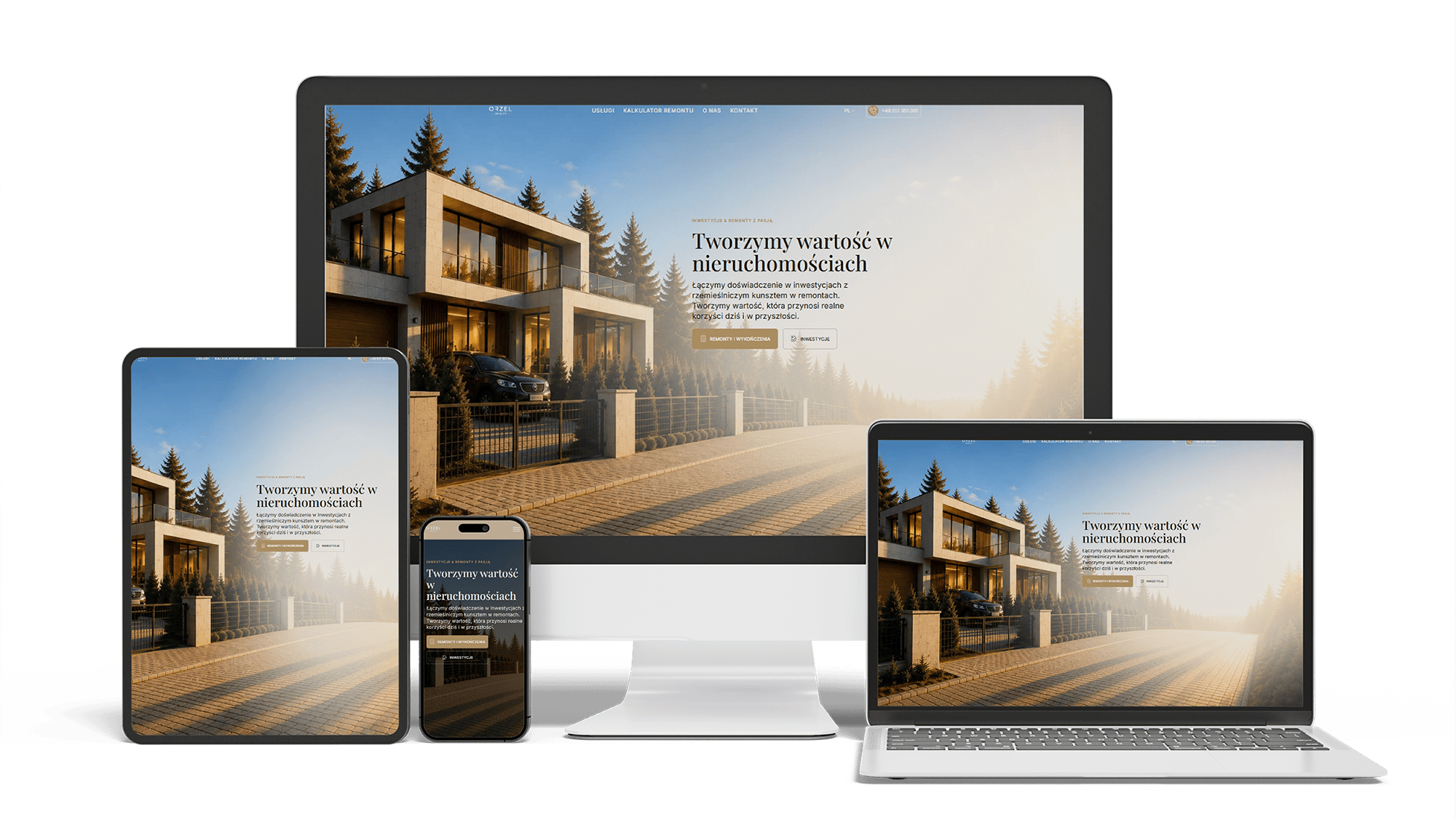
Renovation and investment website with a premium feel and 96/98/100/100 performance
96/98/100/100Design system2 languages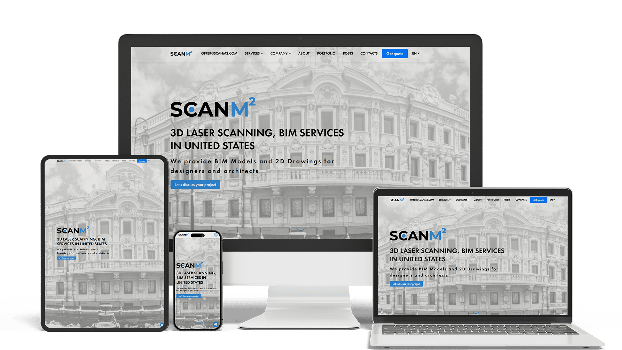
Architecture Website Rebuild and SEO
29× organic trafficLoads in under 1 sTop 3 in Poland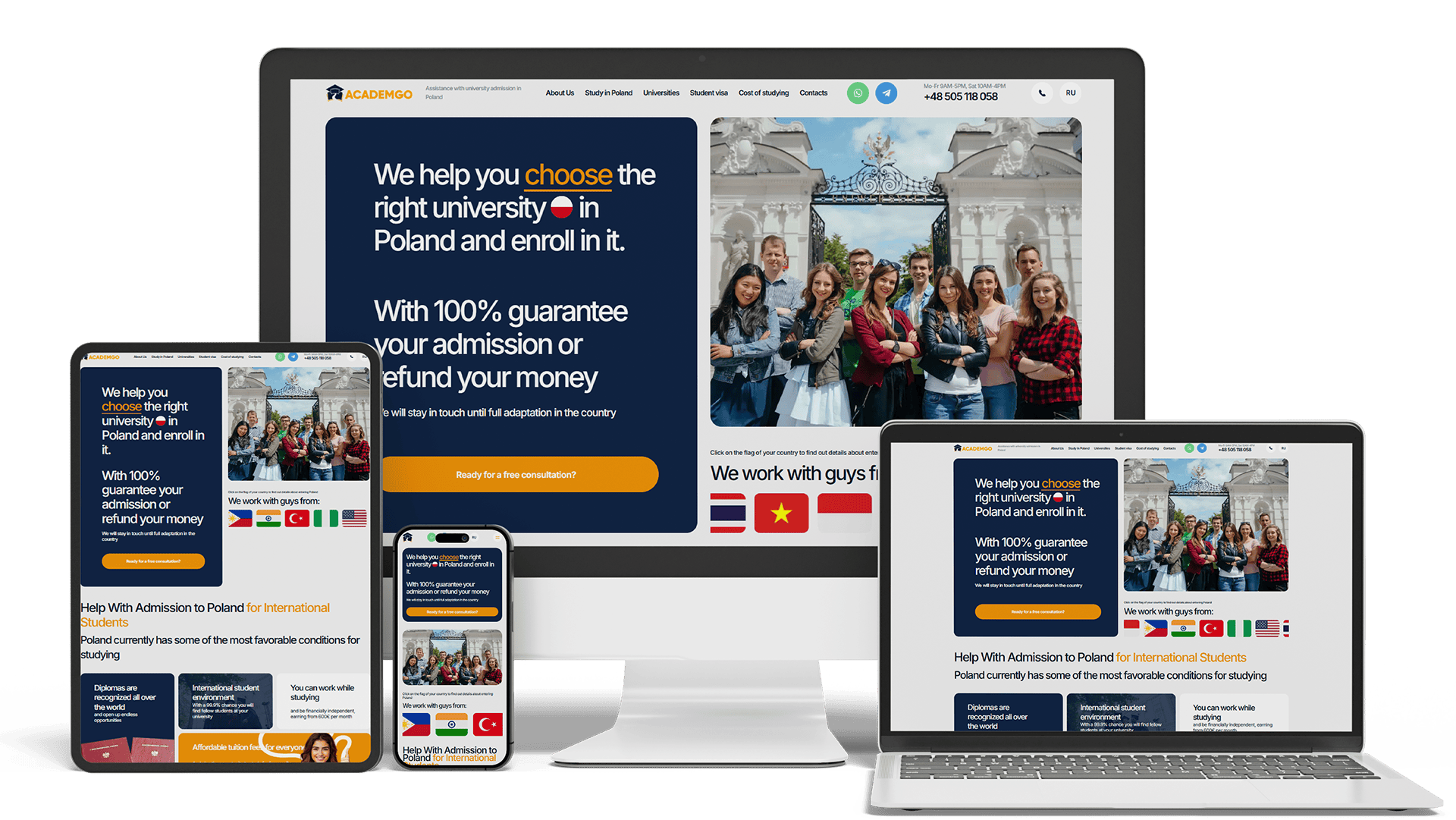
Full Multilingual Website Development & SEO for Student Services
+5,930 clicks in 6 months359k impressionsTeam edits it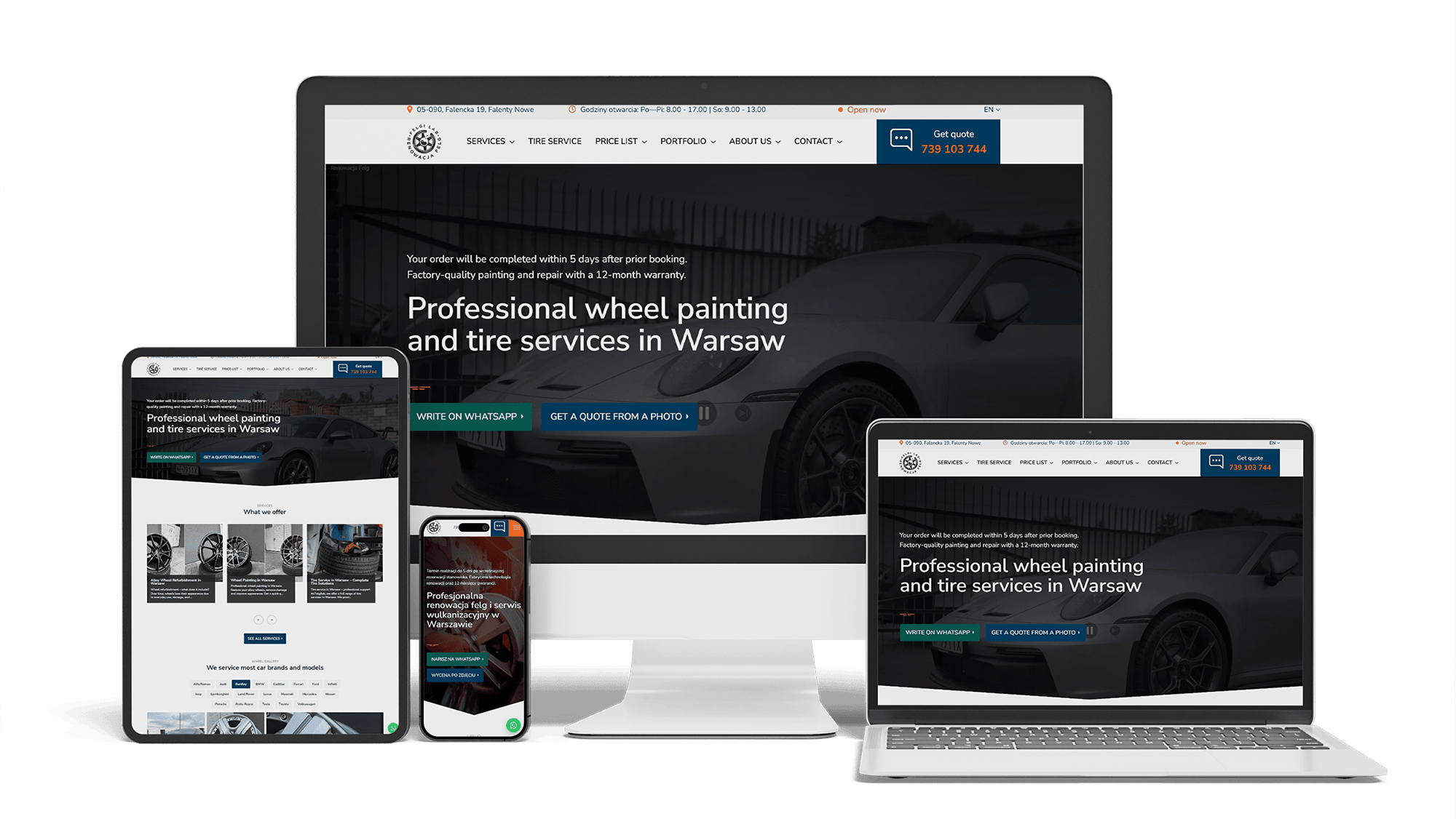
Full WordPress Rebuild for a Car Rim Restoration Company
92/91/96/100Photo quote formLocalBusiness markup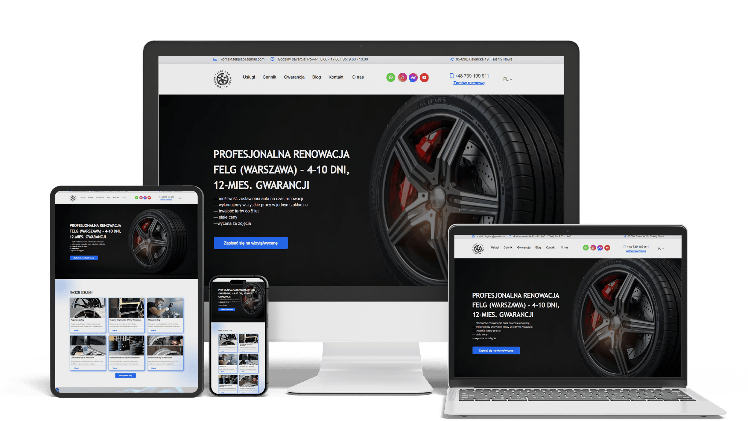
Auto Repair SEO & UX Boost
Performance 90++10% organic trafficLeads from forms
Get a quote for your dental website design
I reply within one business day with a proposed first screen, a treatment page layout and a fixed price.
I do dental website design and build the sites myself, so the look and the working site come from one person at one price. Dental website design starts from a fact every dentist knows: many patients are nervous before they even pick up the phone. The site is opened on a phone by someone who has put off a visit, has a toothache tonight, or is weighing implants or veneers. Each of them should feel calmer after the first screen, and find the next step without looking for it.
Many dental sites look like a brochure for a lab: bright white, steel instruments, close-ups of open mouths, a slider of perfect teeth. For a patient who fears the chair, that is the waiting room they are trying to avoid. A calm design does the opposite:
- warm or soft colors with plenty of white space, instead of clinical blue and steel
- people and rooms on the first screen, not instruments or close-ups of mouths
- plain words — “gentle cleanings”, “we explain every step first” — and no dental jargon in headings
- one clear button per screen, so the page never feels busy
Calm does not mean vague. Each section still says what you do, where and for whom, and a page about sedation or nervous patients sits one tap from the home page.
A patient who is afraid of the visit wants to know who will lean over the chair. A stock dentist answers nothing; your own photos answer it:
- each dentist and hygienist, in daylight, looking at the camera, with a name and a role
- the entrance from the street, so the patient knows where to go
- the reception and the waiting room, ideally with a person in them
- a treatment room as the patient will see it from the chair
A photographer for half a day is worth it; good phone photos taken to a short shot list are the fallback. Video of a dentist explaining a first visit in thirty seconds helps nervous patients more than any paragraph.
For cosmetic dentistry, implants and orthodontics, before-and-after photos are what patients come to see. They are also patient images, so the gallery is designed around consent:
- only cases with the patient’s written consent for use on the website, kept on file by the practice
- photos cropped to the smile, so the patient cannot be identified, unless they agreed otherwise
- a caption with the treatment and the number of visits, without promises of the same result
- the same angle and light before and after, so the comparison is fair
Each case links to its treatment page and to booking. A dozen well-documented cases convince more than a hundred unlabeled photos.
A treatment page — say, dental implants — follows the order in which the patient thinks:
- The problem in their words: “Missing a tooth?”, with the booking button.
- What the treatment is, in two or three sentences, without diagrams of screws on the first screen.
- What happens at each visit and how long the whole treatment takes.
- Whether it hurts and what is done to make it comfortable.
- The price range, what changes it, and insurance and financing.
- Cases from the gallery and a review that mentions this treatment.
- Short answers to the questions patients ask at the front desk, then booking.
Every treatment page names the dentist who wrote or reviewed it, with credentials, and shows the date of the last review. Google holds health content to a higher standard, and patients check who stands behind it. The pages explain; they do not give medical advice or promise outcomes.
Two very different visitors arrive at the same home page. A new patient is choosing a practice and has time to read. A patient with a broken tooth or a swollen jaw wants to know one thing: can you see me today? The first screen serves both:
- a headline that names the practice and the area: “Family and cosmetic dentist in [neighborhood]”
- a “Book a visit” button for new patients, leading to a page that explains the first visit, what to bring and what it costs
- a separate “Dental emergency? Call us” line with the phone number and the hours you take emergencies
- one line of proof: years in the area, the review score, languages spoken
If you do not see emergencies after hours, the line says so and tells the patient where to go instead — an unanswered call at night turns into a review the next morning.
In the US the question “do you take my insurance?” often decides the booking. In many other countries patients pay privately and want prices first. The design gives both a fixed place:
- the insurance plans you are in network with, as text in a list, not as logos only
- a short note on what happens if a plan is not listed
- financing or membership plans explained in one sentence each, with a link to the details
- price ranges for common treatments where you are willing to publish them
This block appears on the new-patient page, on every treatment page, and one tap from the main menu.
Dental practices see patients of every age, and many of those booking dentures, implants or crowns are older, with weaker eyesight and less patience for small buttons. Most of them still open the site on a phone. The design is checked against the WCAG accessibility guidelines:
- a base font size of at least 16 pixels and a typeface whose letters do not blur together
- contrast between text and background of at least 4.5 to 1 for normal text
- buttons big enough for an unsteady finger, spaced apart, and a phone number that dials when tapped
- labels on every form field, not grey hints inside it that disappear when typing starts
- alt text for photos and captions on videos
Accessibility is also a legal question for businesses open to the public in several countries. A design that works for a seventy-year-old patient works better for everyone else too.
More patients now ask ChatGPT, Perplexity or Google’s AI Overviews which dentist nearby takes their insurance, sees children or treats nervous patients. An assistant cannot read an insurance logo wall or a slider of treatment banners. So the design puts the facts it needs in plain HTML: the list of plans, each dentist’s degree and specialty, emergency hours and treatments, plus Dentist and Person structured data that ties them to the practice.
Getting into those answers is ongoing work, described on the AI SEO and GEO optimization page. Being found in Google and on the map is covered on the dentist SEO and local SEO for dentists pages.
Dental website design templates and dental clinic website templates come from three places: dental marketing platforms that bundle a site with their software, general builders such as Webflow, and theme stores. Dribbble and Pinterest add inspiration shots. All of them look calm and polished in the demo, because the demo uses a model’s smile and lorem ipsum. The trouble starts with your content: twelve treatments squeezed into one services page, no slot for an insurance list, a gallery with no field for consent, and a booking embed that breaks the layout on a phone.
For a newly opened practice with one dentist and a tight budget, a template can carry the first year. Custom dental website design earns its cost once implants, aligners or veneers are a large part of revenue, once there are several dentists or offices, or once paid campaigns send patients to treatment pages — the cases where a page that fails costs real appointments.
Lists of the best dental websites mix large groups with small family practices. The decisions behind the good ones are simple and fit any practice:
- a first screen that names the practice and the area and shows real people
- a booking button and an emergency phone number that never leave the screen
- a page for each treatment, written in patients’ words and reviewed by a named dentist
- insurance, financing and prices easy to find
- before-and-after cases with consent and plain captions
- pages that load fast and read well on an older phone
Design is part of building the site, and the price covers both.
- A simple dental practice website: 700–1,400 €.
- A dental clinic website with treatment pages, a smile gallery, insurance and financing pages, online booking and local search optimization: from 2,000 €.
If you already have a site and want a new look without losing Google positions, the website redesign process keeps addresses and redirects in place. Practices beyond dentistry will find more on the medical website design page; full price ranges are on the pricing page.
Dental website design: frequently asked questions
Order dental website design: what to send me
Send the practice name, a link to your current website or Google profile, the treatments you want more patients for, the insurance plans you accept and whether you see emergencies. Photos of the team and the waiting room, even from a phone, let me sketch the first screen with your real faces. You will get that sketch and a fixed price. Use the form above or write on WhatsApp.