


Design, build and optimise a bilingual website for a renovation and property investment company
Two unrelated businesses under one brand, a premium feel in a category that resists it, and a search setup covering four different buying intentions at once.
Client
Industry
Services
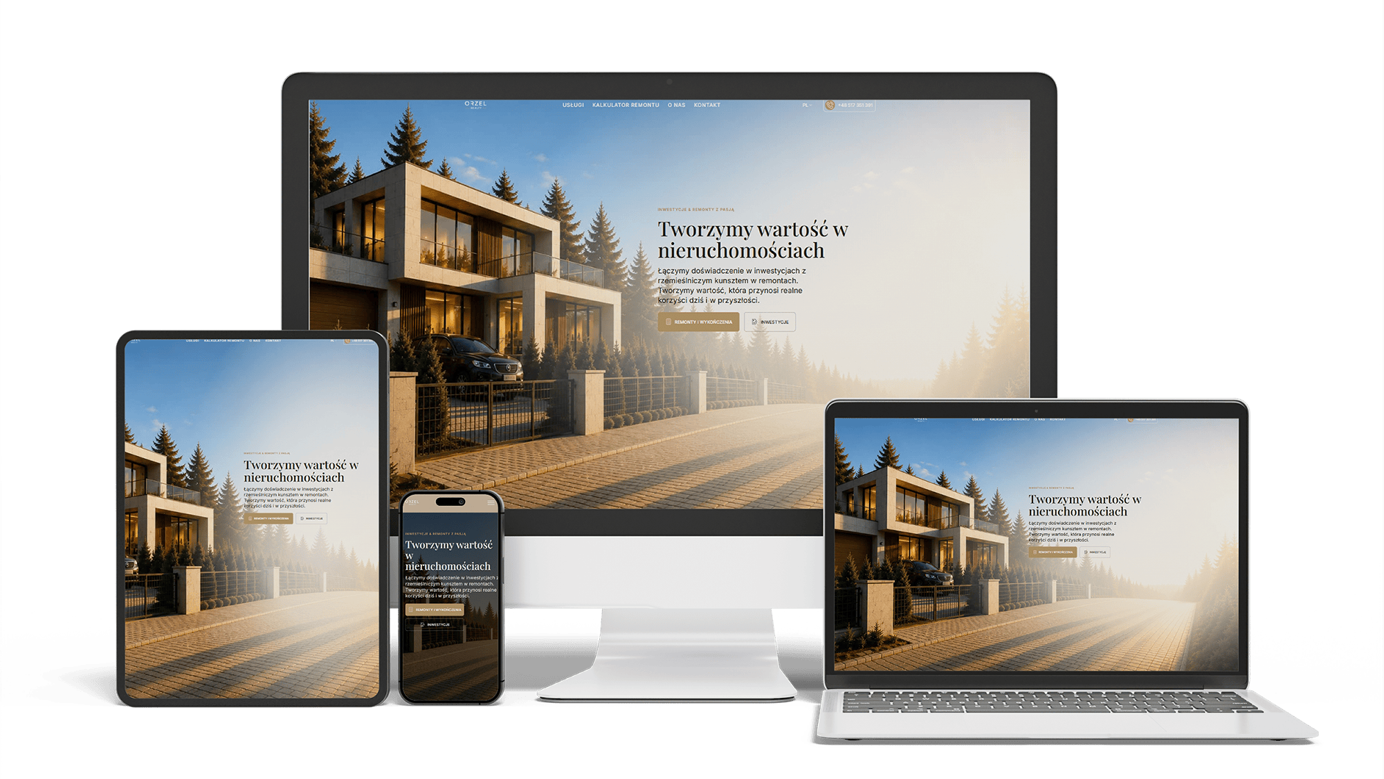
Website
Problem
Orzeł Realty runs two businesses under one name: complete renovations of flats, houses and commercial spaces, and the sourcing and acquisition of land and property for investment, including plots for energy and solar projects. The two share an owner and nothing else. An investor assessing a plot and a flat owner planning a kitchen have different budgets, different timescales and no vocabulary in common — and a single homepage trying to address both usually ends up speaking to neither. Renovations are easier to picture and tend to swallow the investment side; investment language pulls the tone corporate and puts private clients off. On top of that, the company works in the upper price segment, which cannot be stated in words: writing "premium" on a renovation website reads as precisely the opposite.
Goal
- Serve two unrelated audiences from one brand without building and maintaining two separate websites
- Communicate an upper-segment position through restraint rather than through claims about quality
- Answer the price question that stops most renovation enquiries before they start
- Treat the second-language segment of the Warsaw market as a full audience rather than as a translated afterthought
- Give the client full editorial control without making broken layouts possible
- Build for search across four distinct commercial intentions — renovation services, investment services, and the visibility work behind each
Results
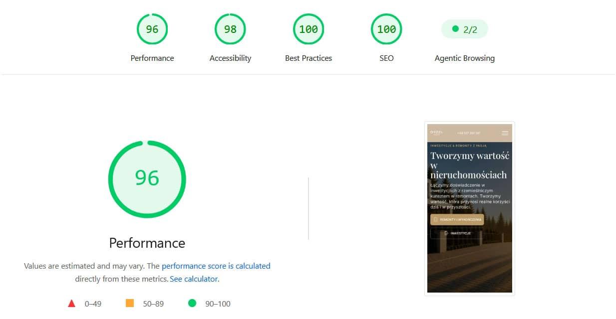
- PageSpeed on the live production build: Performance 96, Accessibility 98, Best Practices 100, SEO 100 — on a site carrying full-screen interior photography, galleries, sliders and an interactive calculator
- Clean pass on the agentic browsing check (2/2) — the page structure is readable by AI assistants, which increasingly act as a discovery channel for local services
- 20 indexable service landing pages — ten services across two sectors, each with its own page in both language versions, rather than one "Services" page competing with itself
- Two independent lead tools — a five-step cost calculator and an enquiry form accepting up to ten photographs — instead of a single contact form
- Leads arrive with photographs attached and reach the team as instant notifications, so the site's "24 h response" claim is backed technically rather than by intention
- A complete second-language mirror of the entire tree: every page, service, hub, form, validation message and confirmation screen — a visitor on that side never meets an untranslated string
- Zero page builders in the stack, and no licence dependency on a third-party vendor
Completed Work
- Design system built from scratch: warm earth palette, single light source across every shadow, token-based colour, spacing and typography
- Custom WordPress theme written rather than assembled — no Elementor, no framework CSS, no plugin holding the layout together
- Library of ACF Gutenberg blocks on a single three-file convention, so every section edits the same way and new sections follow a pattern
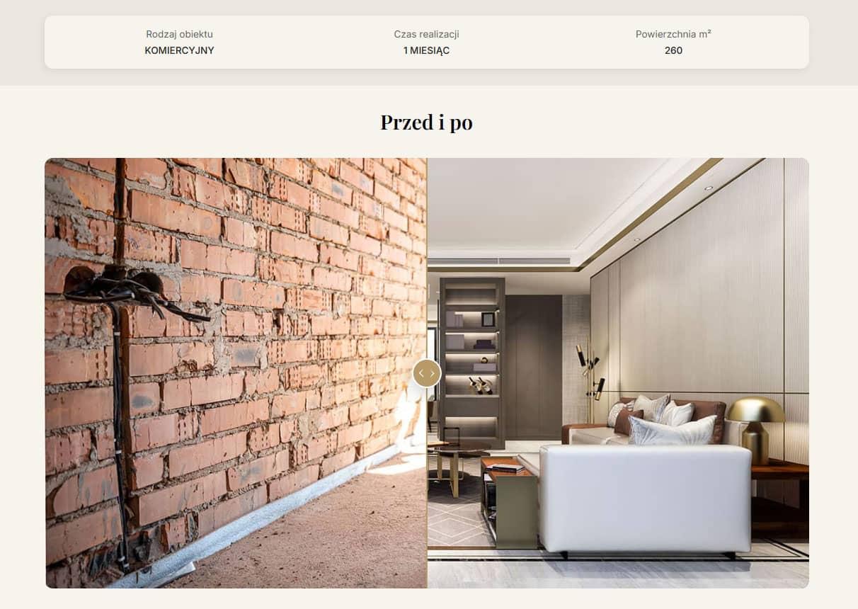
- Two custom post types: services with a sector field feeding both hubs from one source, and portfolio entries with object type, duration, area and gallery
- Five-step renovation cost calculator with server-side pricing logic and results shown before any contact details are requested
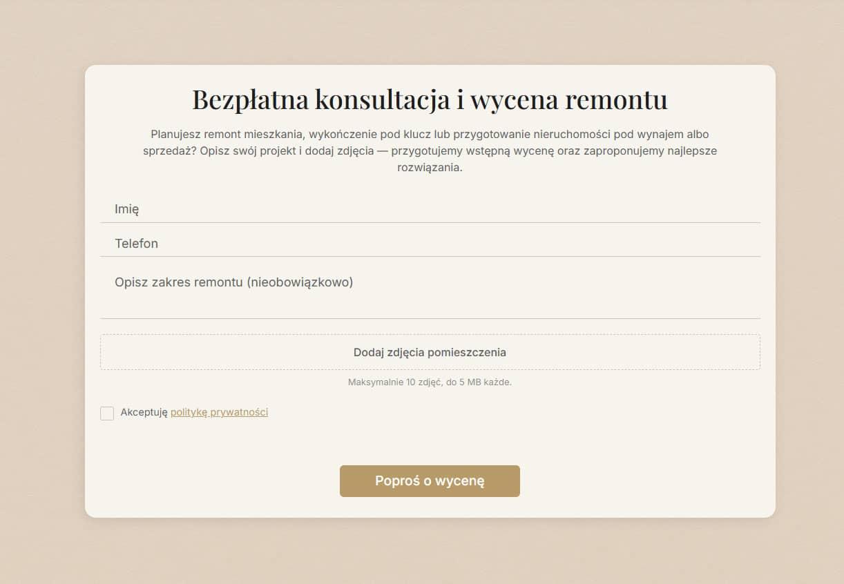
- Enquiry form with photo upload, client-side validation and instant delivery to the team's messaging and CRM
- Complete bilingual localisation, hand-translated rather than machine-processed, with hreflang pairs and a language switcher that goes to the equivalent page rather than the homepage
- SEO architecture: ten service landings per language, breadcrumbs, canonicals, Open Graph, structured FAQ, dense internal linking
- Migration from local Docker to production shared hosting with full post-deployment verification
Project Highlights
Project Description
Why a premium renovation company website is difficult to design
The most interesting problem on this project wasn't technical.
Renovation is not a category where premium positioning is easy. The market is crowded, most competitors compete on price, and the language of the sector defaults to superlatives that undermine exactly what an upper-segment client is looking for. Meanwhile the fastest route to a finished site — a generated template dressed up with stock photography — produces something that looks like every other site in the category, which is the one outcome a premium position cannot survive.
That tension was real and worth taking seriously rather than resolving by preference. A generated layout is quick, cheap and predictable, and those are genuine advantages. What it cannot do is signal restraint, and restraint is how the upper segment reads as upper segment.
How the client and I resolved the template question on a renovation website
The resolution came from separating the two things a template actually provides.
Speed and predictability of structure — a known layout, a known set of sections, no reinventing where things go — turned out to be worth keeping. What had to go was visual sameness: the gradient washes, the carousel of smiling workers in hard hats, the countdown timers, the aggressive scroll animations. Those are what make a template recognisable as a template, and they are also, precisely, what makes a renovation site read as cheap.
So the site was built with the discipline of a system — a fixed block library, a token-based design language, sections that assemble predictably — and none of the visual defaults that come with generated design. The client got the speed and the editability. The category got a site that doesn't look like the category.
Restraint as the design language of a premium renovation website
Premium in this sector is defined more by what isn't there than by what is.
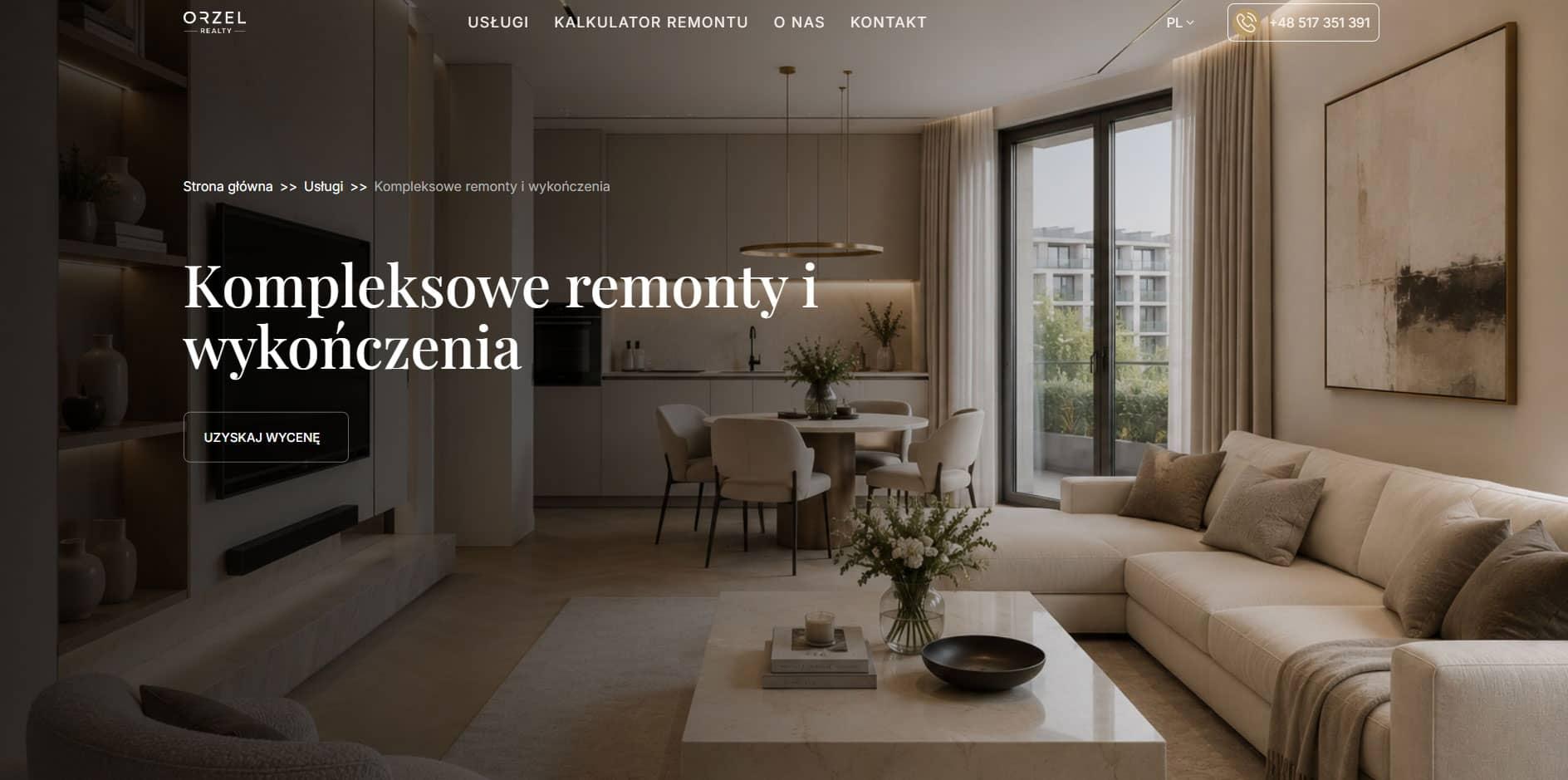
No gradient noise or glows. No stock carousel. No exit-intent popups. No "only 3 slots left" or month-end discounts. No aggressive reveal animations. The palette is a warm earth scale — cream through sand to a deep wood tone — chosen because those are the colours of the materials the company actually works with: wood, stone, plaster, clay, natural textile. The site speaks the language of the trade without illustrating it literally.
One rule ran through everything: every shadow on the site falls in the same direction, as though from a single low sun. It's a detail nobody can name while looking at the site, and it's the difference between a page that feels considered and one that feels assembled from parts.
Splitting a renovation website and a property investment website on the first click
Rather than fitting both businesses into one journey, the site splits its audiences at the very first point of contact.
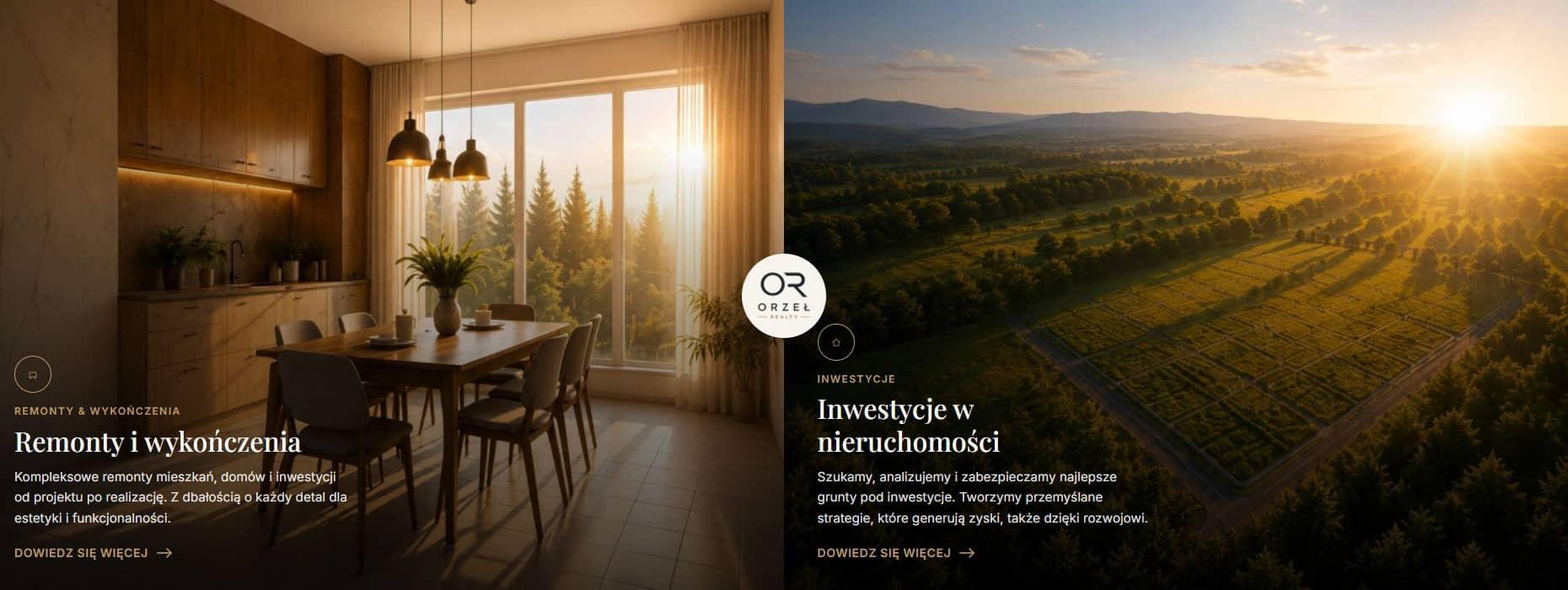
The opening screen offers exactly two doors — renovation works and investment — as full-height cards, each with its own background image, its own subheading and its own promise. It isn't two buttons among five; it's the only decision on the screen.
After the click, the visitor is on a dedicated branch with its own hub, its own services and its own language, while staying inside one visual system. The investment pages aren't diluted with tile and laminate; the renovation pages aren't weighed down with land terminology. One brand, two funnels, one site to maintain.
One service source feeding both the renovation and investment hubs
Behind that split sits a piece of structural economy worth describing, because it's what keeps the site cheap to run.
Rather than maintaining two parallel service lists, every service lives in a single custom post type with a sector field. The renovation hub renders entries tagged for renovation; the investment hub renders the investment ones; the general archive renders everything.
A new service is added once and lands in the right hub automatically. It can be moved between sectors with one click and no template changes. The shared components — card, grid, hover, icon — exist in one copy, so the two sectors cannot drift apart visually. The second language branch inherits the same logic through the same field.
A renovation cost calculator that answers the price question directly
Every renovation company avoids publishing prices. Every prospective customer wants at least an order of magnitude before speaking to anyone. Most leads die in that gap: someone arrives, finds no figure at all, closes the tab and opens the next one.
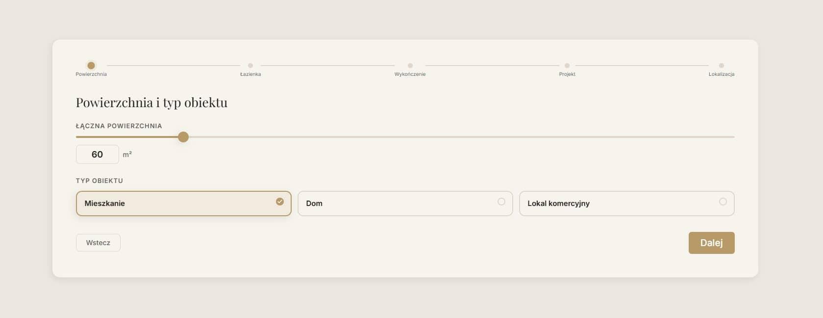
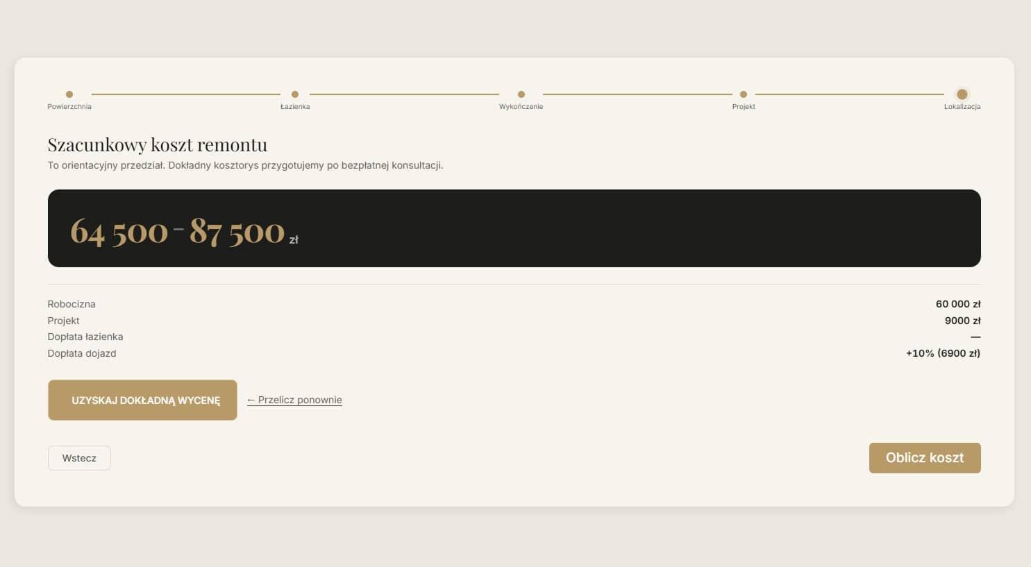
The calculator is the direct answer. Five steps — area and property type, number of bathrooms, finishing level, whether a design project is needed, location — producing a price range split into labour and design rather than a single opaque total.
Two decisions carry it. The pricing model runs server-side, held in editable options, so the rates never reach the frontend bundle and the client changes them without a developer. And the result appears before any contact details are requested: the site gives first and asks second. The alternative — "leave your number and we'll calculate" — reads as a trap and loses most of the audience at the point of exchange.
A renovation enquiry form that collects photographs instead of descriptions
The second lead tool solves the mirror-image problem: uncertainty on the company's side.
The enquiry form asks for a name and a phone number as its only required fields. The description of the work is optional, deliberately — a person who doesn't know how to describe their renovation will abandon a form that demands it, and everything else can be established in conversation.
What replaces the description is photographs: up to ten images of the space, uploaded from a phone in seconds. For the company, that is the difference between "an old bathroom" and a picture showing tiling, wall condition, pipework, window type and ceiling height. Quotes are tighter first time, fewer site visits are needed just to look, and the first conversation starts with specifics.
Each submission reaches the team instantly as a notification with the photographs attached, rather than sitting in an inbox until someone opens it. In a category where the customer is messaging three contractors at once, response speed is often the whole selection factor.
SEO for a renovation website and a property investment website at once
The site had to be found by four different people looking for four different things: someone needing a renovation, someone with land to invest in, and — because both sides of the business grow through search — the visibility work behind each.
Architecture did most of that work. Ten separate service landing pages across two sectors, each with its own hero, its own copy and its own counterpart in the second language, add up to twenty indexable pages built for specific queries, rather than one Services page competing with itself.
Around that: breadcrumbs throughout, canonical URLs, hreflang pairs between language versions, Open Graph and Twitter cards with correct images, meaningful alt text on gallery images, a structured FAQ on the calculator page catching long-tail queries, and dense internal linking with all ten services listed in the footer of every page.
The calculator page deserves a separate mention: it answers the commercial query "how much does a flat renovation in Warsaw cost" with an actual tool plus detailed answers, rather than with a form. That's the kind of page that collects traffic and converts it in the same visit, because it satisfies the intention completely.
Key takeaways from building a bilingual renovation and investment website
The interesting constraint on this project was commercial rather than technical: an upper-segment position in a category where the vocabulary of quality has been worn out, and where the quickest route to a finished website is the one that guarantees looking like everyone else.
What resolved it was separating structure from styling. The discipline of a system — predictable blocks, tokenised design, constrained editing — is what makes a site fast to build and safe for a client to maintain. The visual defaults that usually arrive alongside it are what make a site look generic. Keeping the first and discarding the second is what produced both the restraint the segment requires and the 96/98/100/100 on the live build.
The rest follows from that decision: a design the client can extend without breaking, two audiences served without two websites, and a search structure that treats each side of the business as its own market.