



Short version: the approach worked while few people used it. Black-and-gold now appears on sites at every price level, and buyers have stopped distinguishing by it. Worse, it turns up most often where the price can't be substantiated — and visitors register that faster than they can articulate it. Premium is signalled by what isn't on the page, and by the role a colour is given, which is more expensive to execute and therefore still works.
The brief arrives in a recognisable form: the site should look expensive. What follows is almost always the same — dark background, gold accents, a thin serif.
There's logic behind it, and it isn't foolish. That's how jewellers, watch houses and expensive hotels present themselves. Fifteen years ago the combination read as "this is expensive", and it worked.
The problem is what happened since.
Why black and gold stopped distinguishing an expensive site from an ordinary one
Any visual signal works while it's rare. Once everyone uses it, it stops communicating — not because it got worse, but because it stopped distinguishing.
This isn't only my observation. Muffin Group's April 2026 review of premium palettes puts it plainly: the approach works but is overused, and contemporary brands like The Row and Aesop demonstrate that muted neutrals and warm earth tones signal premium value without the traditional black-and-gold combination.
The reason for the overuse is mechanical. The palette is cheap to execute: it requires no good photography, no considered typography, no thought-through grid. A dark background and gold in the buttons will do.
Two waves compound that, as a trends review on spoko.space describes: first stock themes made thousands of sites identical, then generators started producing something that looks correct in minutes and doesn't look like you. Their phrasing is exact — building a website has never been easier, and never have so many of them looked identical.
Which leads somewhere worth stating directly: the approach became widely available precisely where the rest is harder to raise.
What happens when a recognisable technique turns against you
Something similar already happened to AI imagery, and the parallel is useful.
A survey of working designers reported by Bubble in July 2026 recorded frustration with recognisable defaults from image generators — down to one specific overused hue. The conclusion there is blunt: the defaults became easy to spot, which turned them into a liability for brands trying to look distinctive.
The same thing is happening to black-and-gold on websites, only earlier and more slowly.
A teardown of brutalist web design adds a point that applies well beyond its subject: an aesthetic works when the brand has earned the attention, and fails when it hasn't. A style doesn't create standing — it displays it.
And a survey of creative directors collected by LBBOnline at the end of 2025 produced the answer that fits this topic better than any list of dated techniques. Asked which visual trend should be buried, the response was: not a specific style, but design without substance. The world is saturated, and aesthetics for their own sake no longer hold attention.
What the owner means by the palette and what the visitor reads
The gap between the two is the whole problem.
| What the owner means | What the visitor reads |
|---|---|
| We operate at the top of the market | I've seen this site before |
| Our quality is high | Indistinguishable from the last one |
| We're an established company | Unclear what they actually do |
| We can be trusted | Not one verifiable fact here |
| We cost more than competitors | No price shown — so it's negotiable |
Not one line in the right column is about colour. That's the point: visitors don't evaluate a palette, they look for answers. When there are no answers, the palette is the only thing on the page — and then it reads as a substitute for content.
Why the approach appears most often where there's nothing to substantiate
An uncomfortable observation, but a useful one.
A company with real work shows the work. With named clients, it names them. With a clear price, it publishes a range. It has no need to gesture at its standing indirectly, because it can demonstrate it.
A site where instead there's a dark background, gold rules and the words "premium quality" and "individual approach" is usually built that way not by a designer's intent but because there's nothing to show. The technique fills the space left over once it turned out there were no specifics.
A visitor who has been through a dozen such sites has derived that rule. Not articulated it — derived it.
Hence the genuinely unfortunate part: the technique used to signal expense now signals the opposite to part of the audience.
When black and gold does still work
A necessary caveat, or this becomes a prohibition rather than an analysis.
The approach isn't broken. It works where the rest is behind it. DesignRush's collection of premium sites includes the Meukow cognac house, where black and gold is executed with real photography of the cellars, considered typography and deliberate behaviour on scroll. The palette there doesn't claim a standing — it supports one.
The difference isn't the colour. It's that the colour isn't the only thing present.
One more practical detail from the palette review: gold should read warm and subdued. Bright gold looks cheaper than matte, and this is a case where the shade decides more than the choice of colour does.
What an expensive site is actually made of: restraint rather than volume
If premium isn't in the palette, then where.
The answer I keep arriving at in practice: in what isn't on the page.
No countdown timers, no "only 3 slots left". No exit-intent popups. No carousels of stock people smiling. No end-of-month discounts. No gradient glows or aggressive scroll animations. No exclamation marks.
Every one of those communicates the same thing: we need your enquiry urgently. No expensive business behaves that way, because urgency signals a shortage of clients.
The absence of pressure is itself the signal. It works because a template can't fake it: to afford not to push, the page has to persuade by some other means.
Example one: premium in renovation without a single gold pixel
I built a site for a company working in renovation and property investment. Upper segment, in one of the hardest categories for premium positioning: a crowded market, competition on price, and an industry vocabulary that reaches for superlatives.
Writing "we're a premium company" on a renovation site produces the opposite effect. Restraint wasn't an aesthetic preference, it was the only available method.
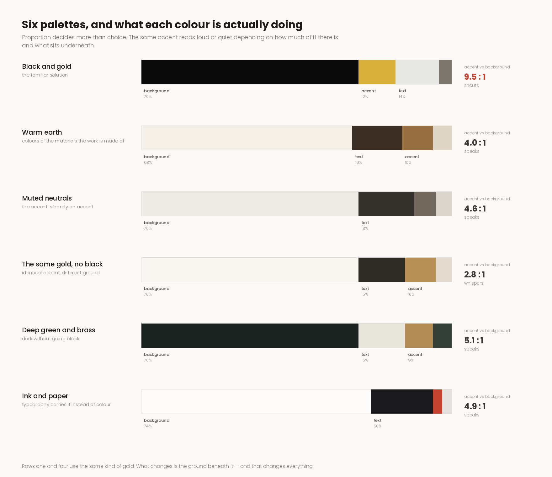
The palette is a warm earth scale — cream through sand to a deep wood tone. Not because it reads as refined, but because those are the colours of the materials the company actually works with: wood, stone, plaster, clay. The site speaks the industry's language without illustrating it literally.
No urgency devices. Not one.
And one rule running through the whole build: every shadow falls in the same direction, as though from a single low sun. It's impossible to notice while looking at the site, and that's the point — it's the difference between a page that feels considered and one that feels assembled from parts.
Plus the thing that substantiates standing better than any palette: a calculator that returns a price before asking for contact details. An expensive company can afford to name a figure first.
Example two: premium on a specialist's site without a black background
The second case is more interesting, because premium positioning was explicitly the brief — and it was solved without giving up gold.
A psychologist practising in Italy. Private practice at the top of the market, where the decision is made by someone choosing who to trust with money, time and fairly personal matters.
There is gold on the site, used in the ordinary way: in rules, occasionally in headings. It isn't that gold was abandoned. It's that there's no black beside it.
The difference is entirely a matter of contrast. On a black background gold becomes maximally loud: every rule and every heading shouts, because the contrast is absolute. On a light background the same gold settles into the palette and works as part of it rather than as a claim laid over it.
The same colour, the same application — an entirely different result, because what sits underneath it changed.
Then the things a typical solution usually lacks do the rest.
Qualifications are stated specifically, not as "years of experience". Diplomas are shown, not mentioned. There's a blog where the specialist writes on their subject, which demonstrates competence better than any assertion of it. And there's the story of how they became a specialist — the path that explains where the specialisation came from.
None of that is about colour. All of it is about one thing: the visitor can check.
Compare that with a typical site where "premium services" and "individual approach" are set in gold on black. The second is louder. The first is believed.
What to do if the site is already black and gold
Don't rebuild it over the palette — that isn't the first problem and usually isn't a problem at all.
The order is different.
First, check whether there's a single verifiable thing on the site. Named clients, described projects, a price range, people's names, documents, registration details. If none of that exists, the palette really is the only content — and that's what gets fixed first.
Then remove the urgency devices. Countdowns, "3 slots left", exit popups. An evening's work, and it changes perception more than any colour change would.
Check the shade of the gold. If it's bright and ringing, mute it and warm it. Minutes of work, visible difference.
Only then look at the palette as a whole. If by that point there's something to show, black and gold stops being a claim and becomes a background — which is fine.
Where to start if the site needs to look more expensive
One exercise: open your own homepage and list everything on it that can be verified. Names, figures, timeframes, people, documents, credentials.
If the list is shorter than five items, the problem isn't the colour.
An expensive site looks expensive not because there's gold on it, but because it has something with which to avoid pushing the visitor. That's the luxury a template can't reproduce.